 |
|||
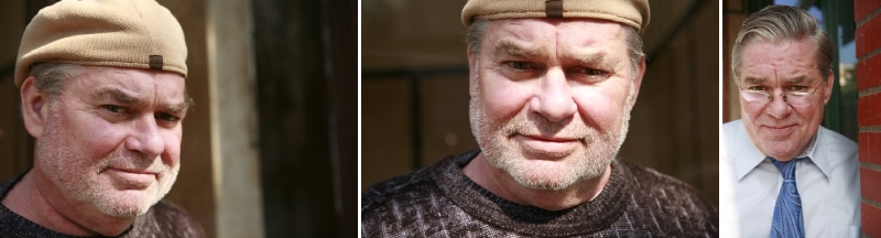
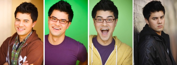
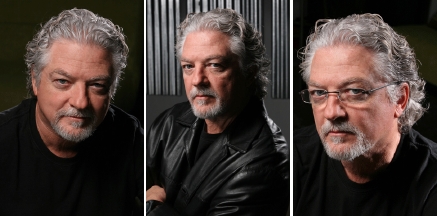
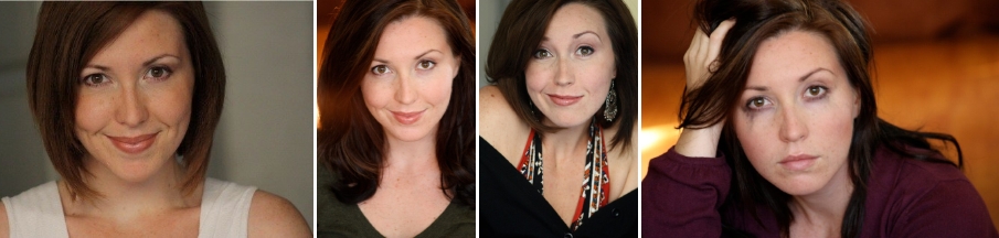
| Long time readers/viewers
of my Facebook vids know I talked about Jim's
transition last year from "portrait" to
"headshot." Now Jim is
sporting a more streamlined (i.e., less-Santa-like) look and his new shots are still wonderful. I'm not a "brick wall lover," but I do adore the natural light and easygoing expressions in each of these shots. |
|||
|
|
|||
 |
|||
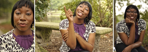
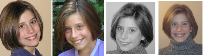
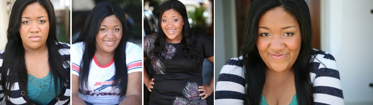
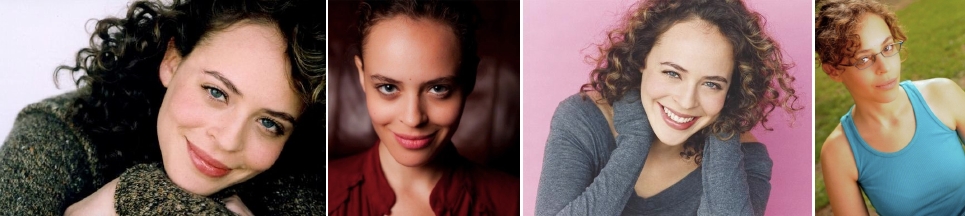
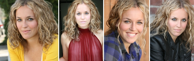
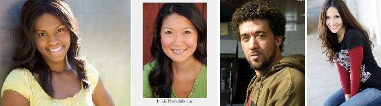
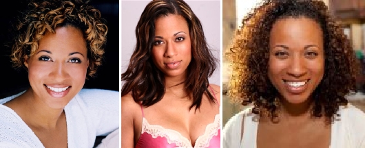
| Ejiro asked me if she had good
headshots or just Facebook profile photos, here. The first
one absolutely can
work as a headshot. The other two do the JC Penney catalog pose and a cute--but less-traditional--photo option for a headshot. |
|||
|
|
|||
 |
|||
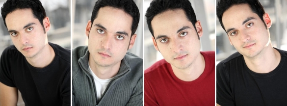
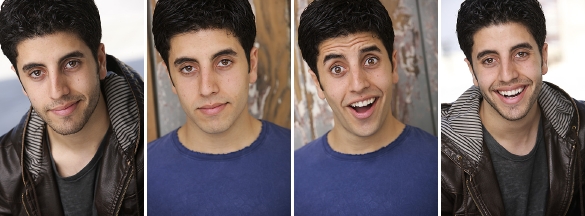
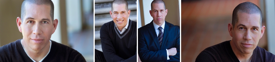
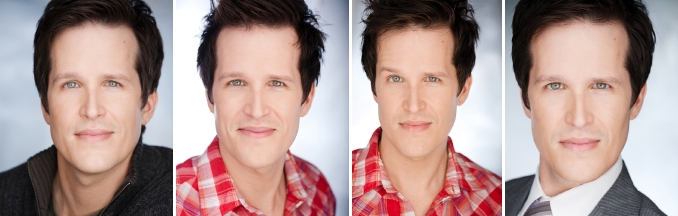
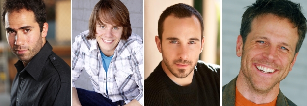
| Alan's headshots are good, but they
give my neck a crick. Keep in mind that we turn our heads
with yours, when we look at headshots. It's a subconscious
thing, and if you're getting a cramp, we may be too. So, my favorite two shots are the middle two (grey jacket, red T-shirt). While I love the little grin in the last shot, my neck hurts looking at it. I'd love to see others from around this moment of the shoot, in case there's something better right around this shot. |
|||
|
|
|||
 |
|||
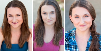
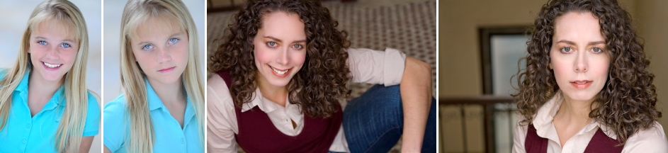
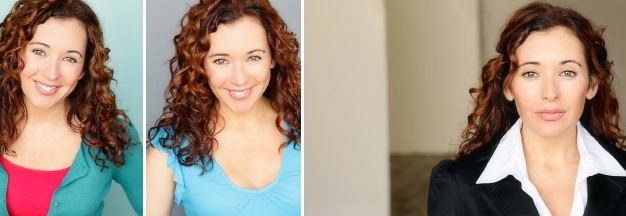
| Tara is 18 TPY.
A pony tail isn't necessary to convey that, organically,
but I get why she did that. I'd just say lay off the lipgloss a bit more and stay "natural" as long as possible, as it's way castable! |
|||
|
|
|||
 |
|||
| Matt's
best
headshots are the natural ones. I mean, I get that there's a
fun-loving, over-the-top character actor in there
somewhere, but I think the yellow hoodie shot is just way too "jazz hands" for getting the point across. The second shot (purple T-shirt, green background, open smile) sends the message without hitting us over the head with it. Still, they're all good shots. I think we may have a case of "You Talked Me Out of It" when shots three and four are both offered up, so think about that. |
|||
|
|
|||
 |
|||
| Sasha's got a sweet look. The problem
is, all these headshots look like they were taken at home,
with a parents' camera, in an attempt to commit without being fully committed. The only of these shots I'd use would be the second one (outdoors), but even that one is marginal at best. Professional photos take care of shadows, light balance, and color correction. These don't. |
|||
|
|
|||
 |
|||
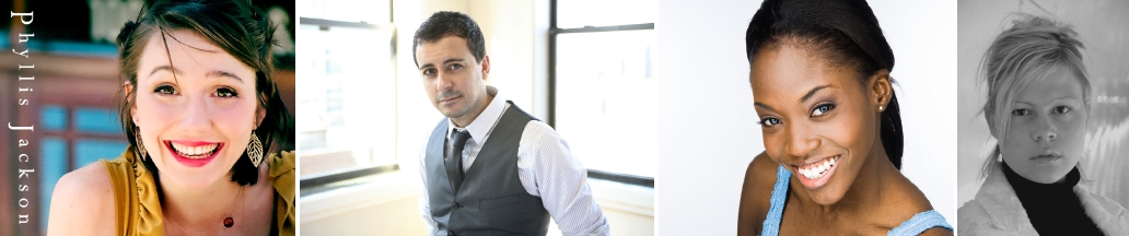
| I love,
love, love Phyllis' photo, except the eye makeup is out of balance. An easy touch-up fixes that. Plus the over-bright light balance. But such a super-cute pose and composition. |
Miguel's
photo is badass. I'd crop it a little bit to put him off-center but otherwise, pretty awesome. |
Jennifer
looks
great, here. I'm usually not a big fan of the chin-down pose, but it kind of works. This is definitely a Cover Girl moment. |
Claudia's
shot is dramatic and pensive, but there's a bit too much head room and not enough light balance to give us an idea of skin tone. |
|
|
|||
 |
|||
| [REDACTED] has a very approachable,
easygoing look, but there's a little too much tension in
the mouth/jaw area in all three of these photos. I'd also
like a bit more warmth in composition. The first of the three is my favorite, but it has an odd angle to the neck. Actually, they all do. But there's nothing that cropping couldn't fix! |
|||
|
|
|||
 |
|||
| Mo gets told he's the wacky type,
sometimes, so he went out of the way to shoot some wacky
shots. Not necessary. Seriously, we can see the wacky come
through, without the over-the-top shots. It's there in the last of these four. And the first of the four is my slam-dunk favorite, as an all-around great headshot for Mo's type. |
|||
|
|
|||
 |
|||
| Lindsey
is told she needs younger headshots (like, to play under
18). I think she's already pushed into the college years,
type-wise, and that's fine! I like all of these shots, but the last is my favorite. I'd really like to see another shot from right around that one, in the session, to see something with less tension around the mouth. But sassy, friendly, fun Lindsey is probably more castable than the "18 TPY" type she once was. |
|||
|
|
|||
 |
|||
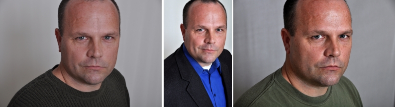
| Keith's first
shot needs the light balance that's been applied to the
last two, but all of these are good. Simple, basic, right on brand headshots for the former military (drama) or Disney doofus dad (comedy) type. |
|||
|
|
|||
 |
|||
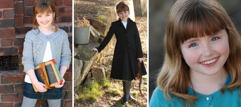
| Emily is a cutie pie. The only shot
I'm crazy about is the actual headshot (third of three). I
understand that kiddos need comp cards that include 3/4 and full-body shots, especially for print and commercial work. But I'm a big fan of the standard, natural light, open smile headshot. |
|||
|
|
|||
 |
|||
| Zurit's
headshots--especially
the first and third, here--are awesome. The second one is
also good, in that it lays out a darker character without talking us out of the primary type. The last shot, however, is a bit weird. It shows us a brainy gal (glasses, smirk, hair up) in a very sporty situation (tanktop, on a sports field). That seems a little incongruous from the others. |
|||
|
|
|||
 |
|||
| Chanté
is too far up against a wall and in the shadows in the
first of these shots; too far hunched over in the last
of these photos, for my taste. The middle two are my favorites, OR the last one if cropped. Very natural smile. Clearly having fun during the shoot! |
|||
|
|
|||
 |
|||
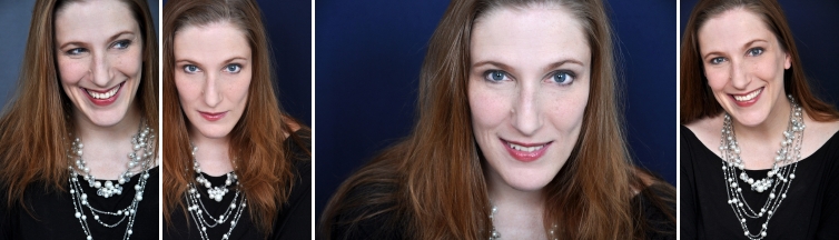
| Oh, in case anyone thinks
it's only you fine folks who go through the torture of
selecting a shot, I just went through it too, after a
decade away from having a formal shoot. The last of these shots--cropped a bit to cut out some of the necklace--is what we're using for my new publicity shot. The first is my fun Facebook photo. |
|||
|
|
|||
 |
|||
| While I love Angelina's
second and fourth photos, as publicity stills, it's the
first and third that are the best headshots (commercial
and theatrical, respectively). I do love the glamor gal shots, though. They just aren't standard headshots, 'til an actor is so well established that the photo is a placeholder. |
|||
|
|
|||
 |
|||
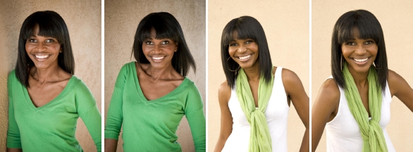
| Alexa's
headshots are good. Simple, straightforward, approachable. All good! |
I'd love Jennifer's first shot more
if it were cropped in tighter. Just lopping off the arm,
the leg, everything outside the hair would make a much more dynamic shot. The second of the two is a little too soft for my taste. |
||
|
|
|||
 |
|||
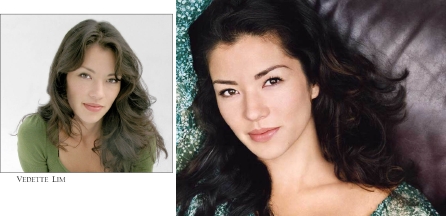
| Vedette
is stunning, for sure. I wish the photographer of the
shot on the right would stop laying women down on his big, chocolate, leather sofa, asking them to put one arm up over their head. I've seen SO many shots like this. Lovely, but more about that photographer than the subject, at this point. On the first of the two shots, I'm a big fan of the "horizontal on the vertical" layout. Very nice! |
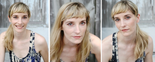
Sarah is Old
Hollywood. Her day-to-day headshot is the one on the
right. But her true, Hollywood glamour shot is the one on the left. Both are just lovely, and filled with the personality that Sarah conveys when she walks in the room. But then she trips. And that's what the second photo delivers even better: That she's quirky. The first is too "hot" to be a klutz. |
||
|
|
|||
 |
|||
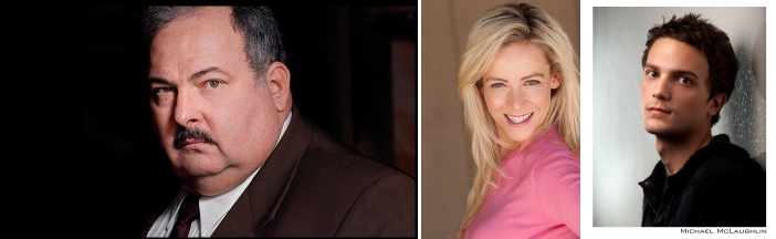
| Ed's
cop shot is awesome. I love it. It's like I'm on the set
with him, in this one. And it's so how he's cast! |
Flannery's
shot is okay. Not great. But it'll do. It's fun! And that goes a long way. |
Michaels'
headshot
is another of those that gives me a crick in the neck. Just an inch of "chin down" could make all the difference, here. |
|
|
|
|||
 |
|||
| I
had to choose from too many shots, at Lauren's
Actors Access profile. Way too many headshots! It's just
unnecessary. Especially when they all look pretty much the same. The only difference is the amount of makeup and how the hair is styled. Because the online services charge by the photo, just pick your primary shot and one secondary. That's all you need. The rest scream "trying too hard" and that's no fun for anyone. |
|||
|
|
|||
 |
|||
| Not
only does Jim
nail the Donald Sutherland look, he does so with enough
of his own edge that it's a done deal we'll want to meet with him. Great shot composition and right on for his primary type. |
|||
|
|
|||
 |
|||
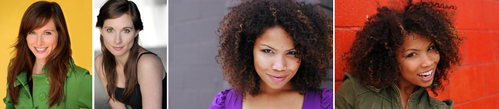
| Jessica's
shot is young and fresh in pose, makeup, and lighting. |
Ron's shot is
filled with life. I totally get him from this shot. |
Tommy
has a great headshot. Very simple. Straightforward. Open. |
Christa's photo is
a little out of place, since it looks like she's up against a warehouse security wall, and that's not quite right for her type. Cropping or blurring out the background more could fix this. |
|
|
|||
 |
|||
| Oh, how I love Melanie's
shots! Except for the last one, which hits on one of my
pet peeves (gals in sexy sleepwear), these shots are fun and spunky and do a very good job of selling who Mel is. |
|||
|
|
|||
 |
|||
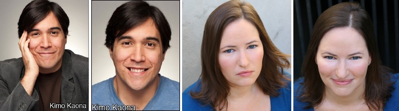
| Kimo looks like
a fun guy, but his photos are just a wee bit "school portrait" in style. I like the first one better than the second, just because it has more personality to it, but they both come across as not quite professional headshot-level headshots. |
Ah, Pamela
is in one of my least favorite poses: chin down, shot from
a foot above. It's code in casting for, "this actor is 10 years older and 20 pounds heavier than she looks in this headshot." And unless we know you and know for sure that's not true, this headshot style does you no favors! |
||
|
|
|||
 |
|||
| Devin has a very
approachable, versatile look. The only one of these I
really don't love is the one in the suit with the arms
crossed. It's almost as if he could get more power by not needing to have his arms crossed, in that shot. So, maybe cropping can fix that. There's enough of a suggestion of power without the physical indication, I think. My favorite shots are the two on the ends. Both very warm and welcoming, with just enough of the glint of personality showing through. |
|||
|
|
|||
 |
|||
| Stacey is a
cutie-pie! Love the first shot for the approachable bestie and the second for the potential leading lady. Very nice shots! |
My-Ishia
has fun, and that's obvious in her shots. I'm not at all a
fan of "brick wall" shots, because the wall almost always pulls focus from the actor in front of it, but not in this shot. My-Ishia is taking control of that shot and that makes it work. Both of these are great shots. |
||
|
|
|||
 |
|||
| Sarah
has a lovely, open-mouthed smile. I love that she's not
hiding that. So many people try to cover their teeth and it's great that Sarah isn't doing that. This is a very castable look and these headshots are right on point for her type. |
Sage
asked about her short-hair shot vs. long-hair shot. Wow,
I'm so 100% sold on the short-hair shot. I just love it! It's hot, it's dominating, it's sexy, it's total Alias leading lady type badass. The one on the right is just too "unsure," comparatively. |
||
|
|
|||
 |
|||
| Ah, Larry,
such a great look! The first three photos are totally
on-brand for how I bet you get cast, every time. The
last of the four, while cute, is just a little too cute for your primary castability. I mean, even if you did go out on a schmacty Nickelodeon project, you'd be the stern principal, not the cutesy, cigar wagging grandpa, right? |
|||
|
|
|||
 |
|||
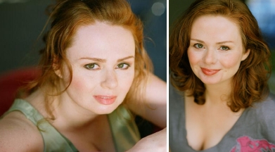
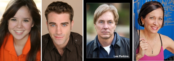
| Love
Brandi's
natural-light, open smile shot. Just want a little more relaxed feel to the smile. |
Linda's
headshot is straightforward and fresh. Very nice! |
I worry
that the photo Scott
is using as his primary headshot is a little too casual, too candid. The lighting is off and it's good, but not great. |
Arielle
has loads of good shots on her site, but when using one like this, the thumbnail must be cropped in a bit, because we lose too much otherwise. |
|
|
|||
 |
|||
| Clark's got
many good shots on his website. My favorite is the first
of these four. Then the second. The third gives us a fun, comedic bent when needed (for very specific casting situations). And the last is a little more serious than I see him, but it works. |
|||
|
|
|||
 |
|||
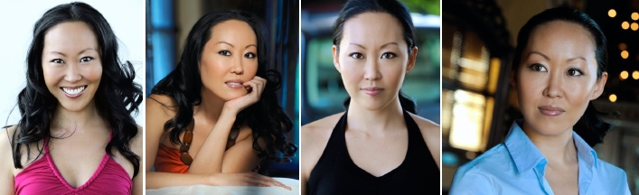
| I adore Christa's
photos. She's got the young mom, the available single,
and the sassy attorney all in just a few
similar-enough-to-one-another photos that we are never distracted from what her primary type is. That's awesome! Some of my favorite, on-brand shooting, right here! |
|||
|
|
|||
 |
|||
| While
I love Annie's
photo, I worry it may push her a bit older than she actually plays. But, man, it's a great shot! |
Ben is approachable
and very middle-America commercial in this shot, and in person. |
Lee's
headshot needs just a wee bit more oomph for my liking, but it gets the job done. I like most of his shots, actually. |
I don't
understand Christine's
shot, since there's a tagged wall behind her, yet she's got plastered down hair and a jacket held by a thread. It's just off and not telling me anything about who she really is. |
|
|
|||
 |
|||
| Jennica
has loads of good shots on her website, but too many,
probably. I love the first one; the second one is fine;
the third one gives me such a grin; and the fourth one, honey, why? Why ever would you smudge your makeup in order to do the "woman in jeopardy" shot? We can get that without the running mascara. It's just trying way too hard. |
|||
|
|
|||
 |
|||
| Mignonette
currently uses the first shot, but is thinking about
replacing it with the third shot (which she sent to me
at a very small size, so it's a little pixelated, unfortunately). I don't prefer one over the other, as they both are castable looks. I just don't love the sleepwear shot, as I mentioned above. I don't understand why anyone needs that shot, as there are plenty of clothing options that sell the sexy without selling the "in your bed" level of sexy this one seems to try to sell. |
|||
|
|
|||
 |
|||
| I think Zelika is lovely
in the first shot, which isn't her primary photo on her site. I really dislike the whole "chin down" thing on the second shot, which I've mentioned above. It's just not as revealing about the face that's gonna walk into the room. And it's a "give away your power" type shot, which I don't get as Zelika's primary vibe. |
As for PJ's shots, I prefer the one
showing a bit of teeth, but neither makes me terribly happy, because there seems to be just a bit of tension around the mouth in both shots. I'd love to see a few candids to know what a truly comfortable PJ looks like, to be sure these line up. |
||
|
|
|||
 |
|||
| Love
Yashar's headshot! Great depth of field and angles. |
Bryan's photo is wonderful! | I'd
crop just a wee bit of the head space on Andre's shot. |
And Scott's
commercial headshot is so completely castable! |
|
|
|||
 |
|||
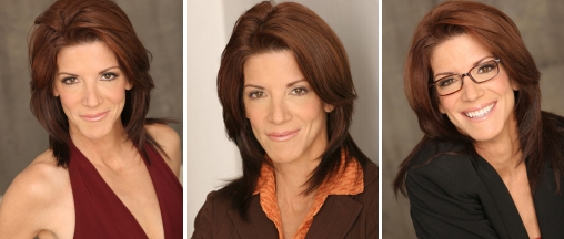
| Finally, there's Tansy. I love
the sexy cougar shot. The newswoman shot is great too.
And the friendly attorney works as well. There are many more, non-essential shots on Tansy's website, but these three--even in studio space--are winners. See? I don't always ONLY love photos taken outdoors! |
|||
|
|
|||
| Remember, a headshot is not a photograph; it's a marketing tool! So, even if it's gorgeous, that's not helpful if it doesn't help get you cast! Think about how you're most likely to be cast. That's what your headshot should be selling, every time. | |||