|
Click on any resumé to enlarge
it.
|
|
 |
 |
 |
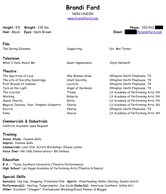
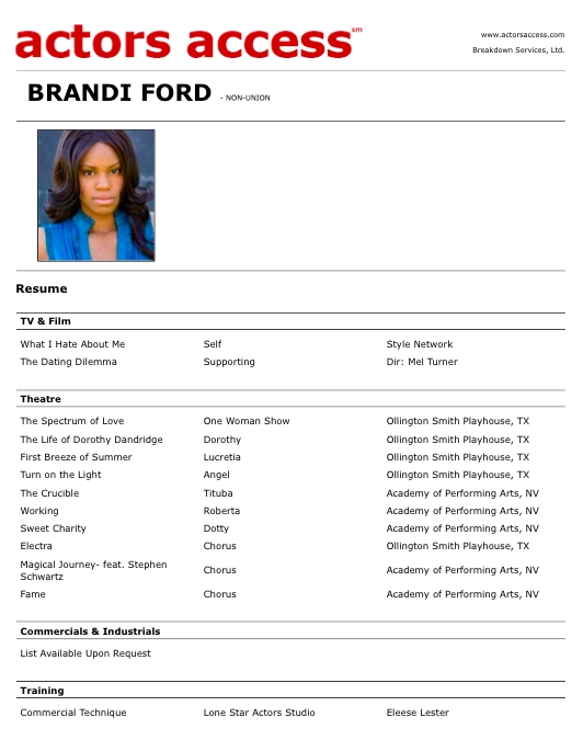
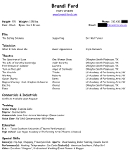
| Brandi's
resumé is good, overall. It's missing the inches notation on your
height (5'5"), it doesn't need to advertise that you're non-union (we
assume that, if you don't list unions--unless your credits are clearly
so high-profile that we assume you are in all of 'em), and I'd warn
against mentioning something like being a "professional blogger," as
some producers won't want someone who might be the next Perez Hilton,
sharing secrets from the set. |
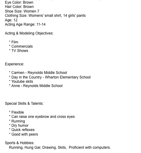
I'm not
certain whose resumé this is, because Jacque (a parent, I assume) sent
it on behalf of an unnamed child. There is also no contact info.
Hopefully, that was just for the sake of getting the content reviewed
(but worth mentioning, just in case). Other notes: include date of
birth for minors, not age and age range. No need to include objectives
like on corporate resumés. Get specific about which "YouTube skits"
starred your child. And I'm not sure that computer proficiency is a
castable "special skill." |
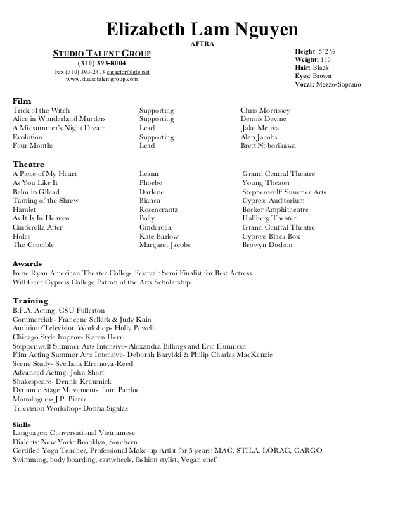
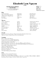
Generally, Elizabeth's
resumé is awesome. It's missing the inches notation on the height
(many, many actors leave this off for some reason), but has neat things
I love like a category for awards. The only major problem I see is the
lack of any direct contact
information (at least a website, if not an email address and/or cell
phone number). Yes, I know you love your manager, but if you two part
ways, his job is not to help me find you, it's to sell me the "new you"
from his roster. Always include on your resumé some way for us to find your current number (like via your website). |
|
 |
 |
 |
| Love the
header for film/TV combined (great before there are a larger number of
credits in each section) that Amy is using but if you're looking for an
LA-style resumé, that section comes before
theatre credits. Also, use the three-column format for the film/TV
section, just like you did with theatre. Also, height measured in
inches only is a bit odd. Otherwise, all good! |
Love love love Jennifer's
resumé. Use of color: awesome. Use of asterisks to indicate premieres:
awesome. Specificity in special skills: awesome. Highlighting a
phenomenal review in the footer: awesome. The only two changes I'd make
are putting the soundtrack credit below on-camera credits and removing
the lone character name in the billing of the second film listed.
Billing is all you need, but if you feel you must note the character
name, do that parenthetically, rather than the billing that way. |
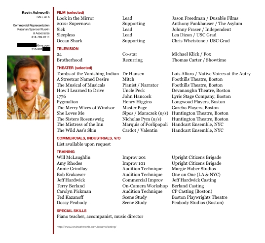
Also love Kevin's resumé. Great use of "mini me" headshot, plus Kevin told me in his email that he had done a lot of Resumé Feng Shui,
which makes for a very focused, streamlined resumé. Pro-level credits
(no more student films or out-of-market projects, no more nonunion TV
which would distract us from the "biggies" in that section,
representative theatre credits rather than a long list of everything,
and very focused "I can do it Right This Instant" special skills rather
than everything he's somewhat good at doing. Fantastic, Kevin! |
|
 |
 |
 |
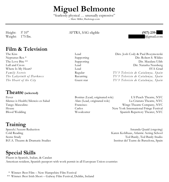
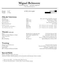
| Miguel
is another actor making use of resumé real estate in one of my favorite
ways: quoting a few words from a great review. Very nice. Also love the
use of asterisks to denote film festival wins and a combined film and
TV section. The use of italics to indicate projects shot in Spain is a
very nice touch. And mentioning the passport and work permits is
essential for working actors in Europe. Well done! |
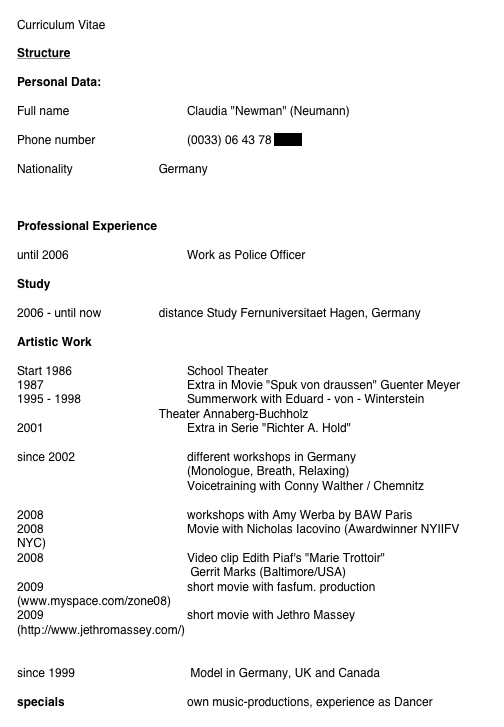
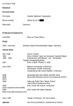
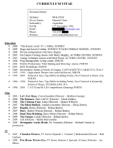
Claudia,
however, is an international actor whose resumé is not at all standard,
if we're looking at a goal of going "LA style" with the format. An
acting resumé doesn't need a header (like "curriculum vitae," used
here). I believe Claudia has added a pronunciation key to her last
name, which isn't essential to do. Listing nationality is something
we'd never do, here, but if that's standard in your market, I s'pose
that's okay. (cont'd -->) |
Another thing
that seems standard in international resumés, but that you'd never do
in an LA-style resumé is listing dates and going to multiple pages. LA
resumés are almost always a single page and you'd never want to limit
your credits by including the dates affiliated with the work. Finally,
listing professional work as a police officer would never be done so
prominently on an LA actor's resumé. Proficiency with firearms could go
in a special skills section, but otherwise, you want to downplay
non-acting career experience on the acting resumé. |
|
 |
 |
 |
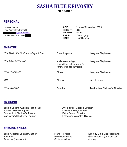
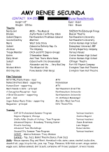
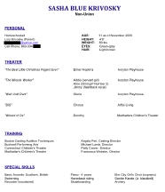
| Sasha's resumé
includes information such as "11 as of November 2009," which is an
effective way to provide a young actor's age without sharing date of
birth, which some folks are nervous about doing. I also like that her
status as a homeschooled child is listed. Sometimes that can make a
difference! Also love the specificity of the special skills (basic,
junior blackbelt, soprano, etc.). The only change I'd make is choosing
either italicized or quoted titles, but not both (and truly, you need
neither, as we know the first column is a list of titles even without
special formatting). |
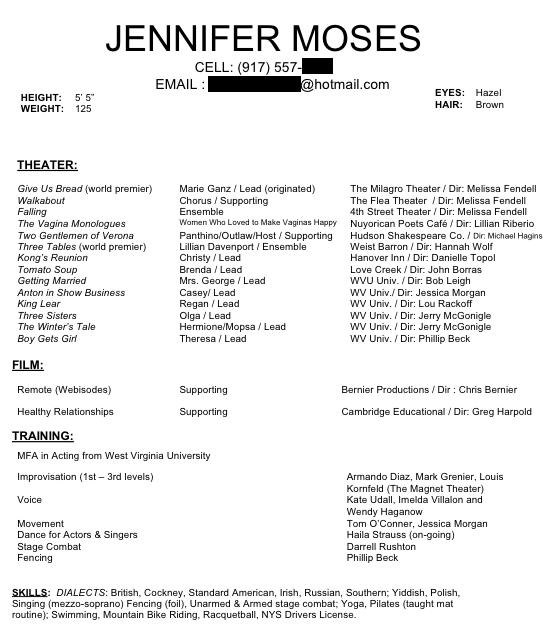
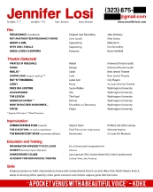
Jennifer's
resumé is generally good. I would flip the film and theatre sections,
for an LA-style resumé, but if you're working in New York, this is
probably more standard for your market. There are large gaps between
your film credits, which is a little distracting, visually. Also, not
sure why you've used a semicolon between Southern and Yiddish (a comma
makes more sense), and you need a comma before Fencing. Love the
"ongoing" note after the name of an instructor with whom you're
currently training. Very nicely done. |
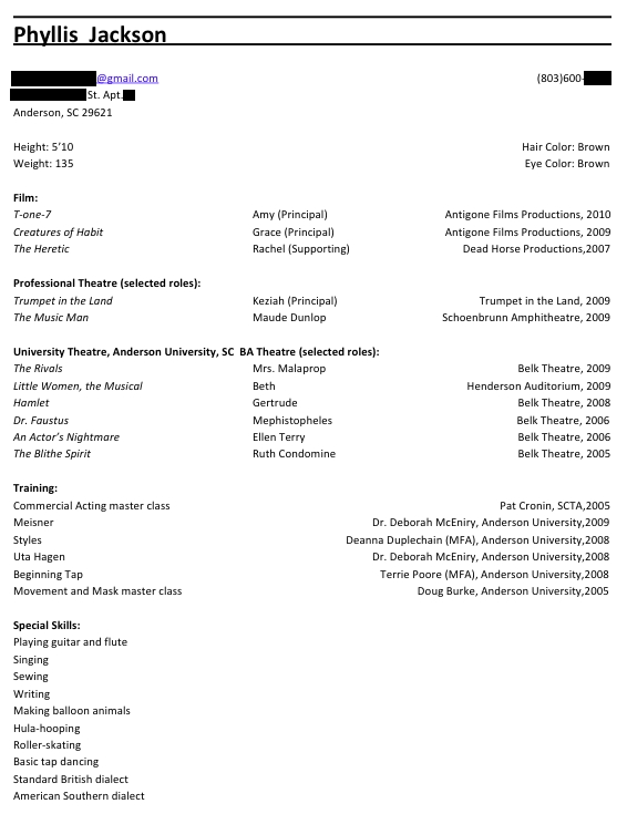
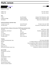
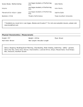
Phyllis'
resumé includes her home address. Nooo! You aren't sending out the
resumé so people will mail you things or come visit (and you know most
of your submissions will end up in the trash). Don't give out info like
your address or Social Security Number 'til you're hired. (Yes, I've
seen that happen!) I'd merge the two theatre sections, and take off all
of the dates. Also lose character names in the film section and turn
your special skills section into a block-style, comma-separated list of
items. Same note about the inches mark in your height. Oh, and no need
to mention that your professors were doctors or MFA-holding
instructors. It's your resumé, not theirs. |
|
 |
 |
 |
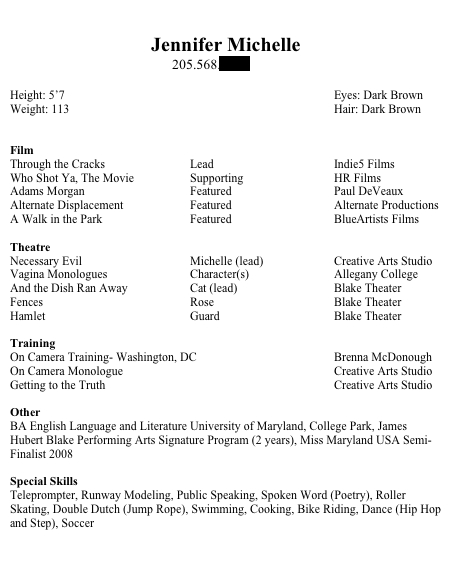
| I have only
one comment on Jennifer's resumé: put the inches notation in your
height (make it 5'7" rather than 5'7). Otherwise, everything is great.
Simple, clean, and informative without being cluttered. |
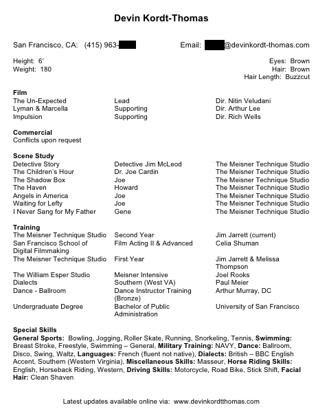
Love Devin's resumé. We've had a chat on Hollywood Happy Hour
about out-of-market phone numbers and I love that you've confirmed your
geography right on the resumé, so there's no confusion. Next edit, you
might want to minimize the scene study section, but as you're building
experience, it's okay. |
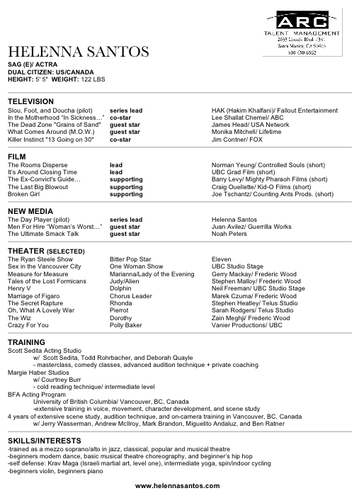
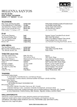
Helenna's
resumé is almost perfect. I love the new media category (this is
wonderful when you have several high-profile Internet projects). I'd
note episodes parenthetically rather than using quotation marks, and
remove the spaces on the right side of every slash used in the third
column. Dual citizenship is definitely worth noting and I love the
specificity of the special skills. I'd lose the parenthetically noted
"short" for each of the short films. We really don't need to know that. |
|
 |
 |
 |
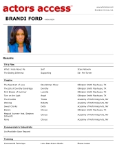
| Yes, I already showed you Brandi's
downloadable resumé, but this is her Actors Access profile, which I've
included because I love that she's combined the film and TV sections
and... (cont'd -->) |
...she includes her local hire status and
the fact that a more detailed and regularly updated resumé is available
at her website. Great use of space in the online profile at Actors
Access! |
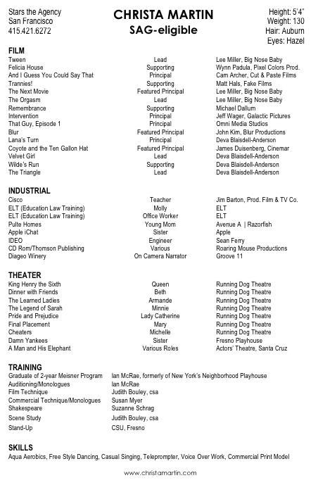
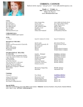
Christa's resumé includes industrials, which is fine in a minor market. Love the specificity of the special skills (casual
singing) and website listed in the footer. I'd use the tab button for
that center column, rather than the more ragged-looking true centering,
but otherwise great! |
|
 |
 |
 |
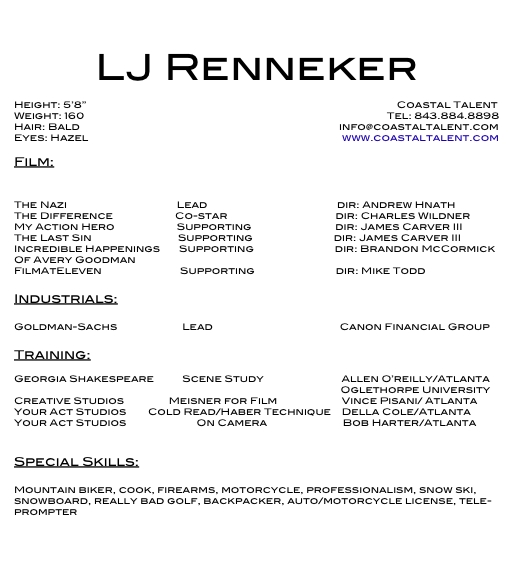
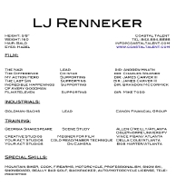
| LJ's
resume is from a minor market, so I'll say the industrials can stay
(you'd pull those off in Los Angeles). Add your direct contact info
(see above). Looks like you've used the space bar rather than the tab
key to space out your columns, and that's no good. Keep it clean by
tabbing! I don't love the all-caps presentation, but it's not awful. If
you send a Word resumé (or provide that on your site), you're trusting
that we have your fonts installed on our machines. We may not, and that
could throw your formatting all off! Love the "really bad golf" skill.
My husband has that on his resumé too! |
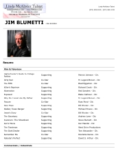
Jim's
Actors Access profile does a lot of things right. He indicates which
people are directors in the third column (with the use of "Dir." as the
notation) and also lists production companies (remember, I love making use of the most important information, rather than being militant about only listing directors' names or only listing production companies or networks, etc.). (cont'd -->) |
I also love
that Jim mentions the types of commercial credits he has had running,
but doesn't list the specific commercials (which could make folks see a conflict
where none may exist). Super happy about his use of the space on the
second page of the Actors Access profile to list URLs at which we can
get more information (his website, a link to his reel, his IMDb page).
Very smart! |
|
 |
 |
 |
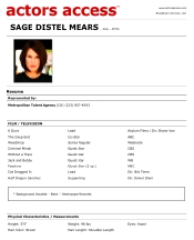
| I'm sharing Sage's
Actors Access profile for one reason: To demonstrate that when you are
working at a tier or two above where you started out, and on your way
to becoming a household name, (cont'd -->) |
...you don't
need to try and pack your resumé with "little credits." A minimalist
resumé helps us focus on how awesome your credits really are. We're not
distracted by the "tier below" stuff you did years ago. Outstanding! |
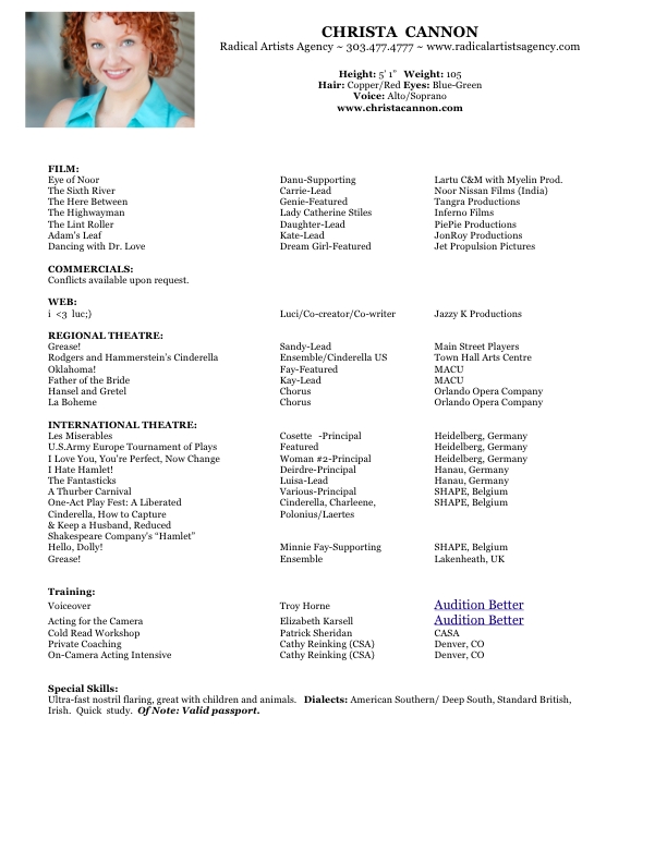
Love the "mini me" headshot on Christa's
resumé, plus commercials upon request and a web section. I'd remove the
character names from the film section and the billing from the theatre
section (we all know Cosette is a principal role). Love the "nostril
flaring" special skill and the only formatting issue seems to be the
"Audition Better" training. It's a larger font and underlined, which
doesn't look good. |
|
 |
 |
 |
| PJ doesn't
need to share that he's non-union on his resumé but he does need to
include some direct contact information. The order of the three columns
(which need to be separated by tabs) is flipped. The project goes
first, then the billing, then the production company or director. I'd
put the Internet section before theatre and check to see if the font
used in the college training section is smaller than the rest. Also,
this is one of those times when you must do a double-check to be sure
the margins aren't getting cut off, on others' computers. |
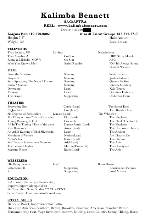
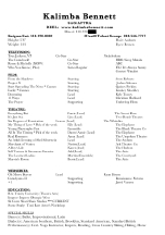
Kalimba
offers a downloadable resumé from her website, but it has popped to two
pages and has formatting issues due to the Word problem I mentioned
above. Offering a Word doc is never as good as offering a PDF, because
you're trusting we have your fonts installed, and we might not!Love that she includes her website and direct contact info. (cont'd -->) |
I'd watch the
use of asterisks instead of bullet points as formatting options in the
resumé. We may think you're telling us to look at the footer for the
asterisk to be resolved, otherwise. Looks like the special skills
header isn't bold and is missing a colon, if you meant to have it
formatted like headers in the rest of the document. Also, I'd lose the
parenthetical S in each of the special skills, since you are listing multiple items each time. It's not like you don't mean to use the plural each time. |
|
 |
 |
 |
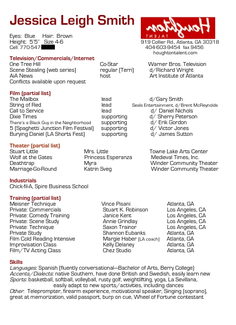
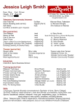
| Jessica's
is a good out-of-market resumé, which means it's okay to include
commercials and industrials, and possibly even your dress size, which
you'd rarely see on an LA-style resumé. The center tab stop is off if
you compare the theatre section to those above and below it. Love the
parenthetical notation of film festivals associated with projects. I
like the inclusion of Los Angeles training, even on an Atlanta resumé.
That can carry weight. The biggest issue is the agency logo. It's
flipped! Have you not noticed that? Ack! |
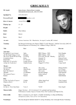
Greg's resumé
is great with the use of the "mini me." I'd get rid of the age range,
add the inches notation on the height, and take out the header of
"title, part, company, director." We know what the sections are without
that guideline. Love that you noted how many episodes you did of
certain TV shows. Don't need to know if a film was a feature or a
short. I can always look that up on IMDb if it matters. And, as with
the other international resumés, I'd get rid of the years where they're
listed. |
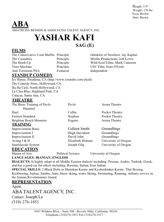
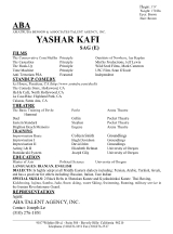
Yashir's
resumé is generally good, but do we really need three instances of
agency information (up top and twice at the bottom)? And of course, I'd
like to see your contact info
included. I'd love a little breathing room between each major section.
I'd get consistent on the center tab stop, as it's sometimes more
centered than others. Not sure the poly sci degree is worth noting on
an acting resumé, but it's not a problem either. What is
a problem is that you've misspelled principal. The size of the role is
described using an adjective, that adjective is principal (you can
remember it's an adjective because of the letter A in the word). Love that you've added a YouTube link for reference in your standup section. |
|
 |
 |
 |
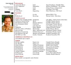
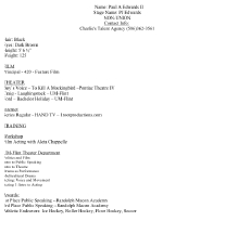
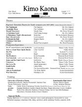
| I'm generally okay with Kimo's
resumé, but I'm not sure the heading "production experience" is
correct. It looks like all of this is theatre work, which is cool, but
I'm not sure you need to split up the two types of theatre credits like
this. Maybe that's best in your market, though. You asked in your email
about adding projects on which you've "come close." Nope. Don't do it.
Mention those in cover letters or meetings if you feel the need to do
so, but they're not credits, so they don't go on your resumé. Be
patient. You'll get 'em! |
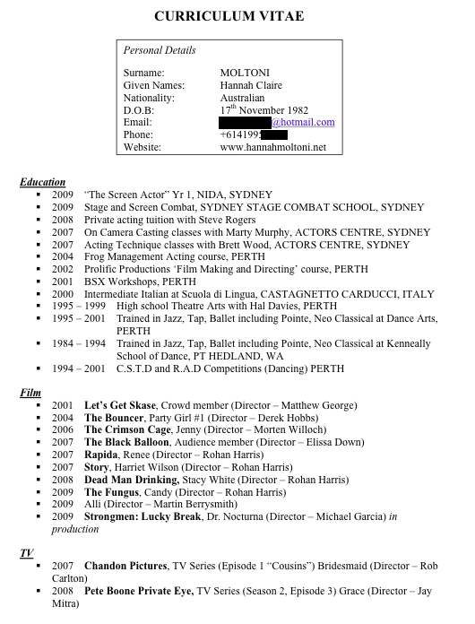
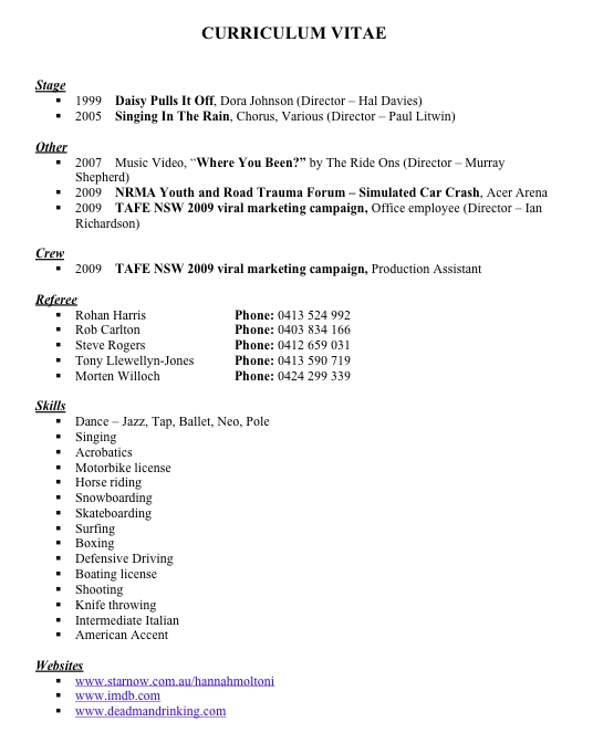
Looks like Hannah's
Australian resumé is another two-pager, like the European ones. For
LA-style, you're going to want to take off the header (curriculum
vitae), remove your date of birth (that's only for people under 18),
and remove all dates associated with your credits. Next, let's re-order
the sections. First, for LA, would be your film section (and it looks
like you're listing extra work among your principal acting credits.
Don't do that). Next section would be TV. (cont'd -->) |
Third
section is stage, then your education/training is fourth. Finally, your
special skills, which get listed in a block of text, separated by
commas. I'd cut the crew items, list of references, block of websites
(just one is enough), and I'd find a way to put the items you have
listed as "other" in an existing section (maybe you could retitle the
stage section to "live performance" to include the simulated car crash
project). Generally, music videos are not included on acting resumés in
Los Angeles. All of these changes should get you to one page, which is what you're shooting for! |
|
|
|
| Remember,
a resumé is not a list of everything you've ever done; it's a marketing
tool! So, listing everything
may make you feel better, but if it doesn't teach us how to cast you
next, it's not helping you. Think
about how you're most likely to be cast. That's what your resumé
should be selling. |