|
|
||
 |
 |
 |
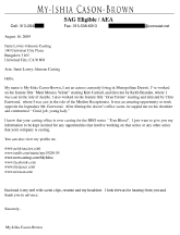
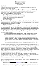
| Lots to love about My-Ishia's cover letter to a major Los Angeles TV casting office. Header with all contact info and union status, and a "not too long" letter of introduction, highlighting experience. Three things I'd change. One: the long list of links. Fine to provide links where casting can find more info about you, but so much better to just direct traffic to your site, and provide links there to all of the other places. (And, if you must include other sites in your letter, give us the whole URL to your Actors Access, Facebook, and MySpace pages, not just the general URLs for those sites' main pages, where we can then "search you out." It's not likely we will! Next, you mention that your reel is enclosed. Honestly, almost no one is taking the time to pop that sucker in, so don't waste the money. Just tell us it's available at your site, and if we're interested, we'll check your work out there. Finally, a general submission to a casting office is of far less value than a role-specific submission. Do some research on any of the many other shows casting in this office and do a targeted mailing rather than a general, if you're hoping your submission will stick around. Still, great letter! Good start! | While Brittany's cover letter is super cute and filled with creativity and personality, it's just far too long. There's got to be a way to get the goods in there without overpacking one page like this. (And I don't mean going to a super-small font or anything clever like that.) Maybe the "scene" could be a separate page? Or edited down a great deal? Ah, it's tough, because it is so cute! Great bullet points, but your use of superlatives adds to the length of the letter. Consider being more efficient with your choice of words. I do love the tip of the hat to what it is the CD you're addressing has done, but I worry that's coming too late to have an impact. If someone's just skimming, they may not even get to that point in the letter, to see you've done your research about them. Very good to have included your contact info as well as your rep's info. Smart! And of course I love the review line in your footer. That said, I'd probably attribute that good review using the show, rather than the job title of the person who supplied it, as that's likely more relevant for the person to whom you're sending this particular letter. | Kyle's
promo postcard for his recent booking is pretty dang awesome. I'm a big
fan of staying on the radar of folks in casting by sending out these
booking notices (and doing so without any sort of expectation of what
might come of the mailing, beyond staying on our radar. It's like the
billboard analogy I've used many times before. We see a Coca-Cola
billboard several times and somehow have a need to reach for a Coke
when we're faced with a tasty beverage decision, at the market. No one
expects that seeing a billboard will cause an immediate, reactive
purchase on our behalf). Nice to include links about the film and
to the actor's credits, but I worry that also including the YouTube
link might be overkill. You can always include Kyle's YouTube link in
his Actors Access profile, or park all of the links on his own website.
One of my favorite things about letting folks know about a booking is
that, well, let's face it, you could have your footage end up on the
cutting room floor, as they say. So, by celebrating the booking, you're
taking advantage of the heat that choice could provide. Next will be
the celebration of the premiere. And then the DVD release. And so on!
As for the composition of the postcard itself, it's a little on the
dark side, but that's the style of the film, so that's okay. What's odd
is the title of the film. According to IMDb, it's John Carter of Mars (not on Mars),
and I worry that looks sloppy, since that's certainly something you
could've looked up (even if the title had been incorrectly communicated
during the audition process--or changed since then). Also, Kyle is not
listed on the film's IMDb page yet. Of course, we know that can take a
while to materialize, so that last part isn't a deal breaker, but it's
worth noting, in choosing your wording on the postcard. Want the best
spin possible, right? Regardless, congrats! This looks great. |
|
|
||
 |
 |
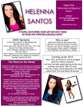 |
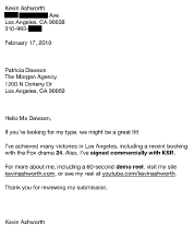
| Good work from Rich. I'd add the date (just a formality, but helps with record-keeping, for those who do that), but that's a minor note. I'm not sure it's necessary to draw attention to your un-represented status. The truth is, the majority submissions are coming through on specific roles (and yes, through agents and managers), so just get to the point that you're looking to get on our radar, rather than highlighting your lack of representation. As for your physical condition, I love that you get into that. I wonder what groups like Performing Arts Studio West or others endorsed by SAG would recommend, in terms of disclosure upon introduction. Certainly, there are pros and cons to any approach, but I love the "put it out there" way you've handled your cerebral palsy. We always need real people, in casting. I'm a big fan of being real, from the get-go. | Kevin calls this his "generic" cover letter, noting that he adds another bit of connective information if his research yields such a thing. He's also been going shorter, with each mailing, which I love hearing. Long letters rarely deliver the impact actors hope they will. The only problem I have with this letter is how very dry it is. It doesn't show a glimpse of personality, if I'm reading this before I've met Kevin. Except, I have met Kevin, so I can vouch for the fact that he is a dry, deadpan type guy sometimes, so in that respect the letter is dead-on. But that brings up the issue: How do you convey your vibe, your type, your brand before we've met you, without coming across as just minimalist? I think the addition of a review tagline or a personal brand line (I think we discussed, "tall, dark, and handsy") could make a difference. | I'm not sure I'll be able to accurately convey to what extent I am crazy in love with Helenna's one-sheet. She tells me that she created this under the guidance of Dallas Travers, and WOW! do I love it! This is such a great example of actor branding, non-traditional content, and just good
marketing. The colors go with Helenna's website (which we'll get to in
week five of the Critique series) and her highlights are impressive.
I'd probably use italics for show titles, rather than putting anything
in quotation marks (especially because quotation marks are used in
blurbs from the industry and--inexplicably--in Helenna's tagline), but
that's such a tiny, stylistic switch-up from what's happening here.
Other changes I would make are super minor: fewer boxes with keylines
and more shaded/offset blocks of information, more white space, and
Helenna's contact info in the footer of the document, as--when a
document is otherwise crowded--that's where my eyes go to get the juicy
details for making contact. Also, be careful when emailing this around
that its margins won't get clipped when printing. I know you can't be
responsible for everyone's printers (and this is mostly used as a
mailer, Helenna tells me), but just something to keep in mind, again,
in terms of white space and flow. But all
of this is super-ridiculously nitpicky. I'm so crazy in love with this
one-sheet and think it's a great leap from the standard "actor gimmicks" that show up in the mail every day. |
|
|
||
 |
 |
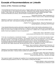 |
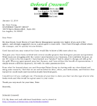
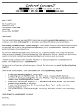
| Deborah is going to be covered in this whole row. She sent a current "cold" cover letter, an older "follow-up" cover letter, and a list of references/reviews she usually includes in her package to agents. On this cold cover letter, my only note is that it's a little on the long side, but really, that's so Deb. Knowing her, this is actually half the length I'd expect! She has done a lot in her many years as a pro, and she has a lot to say, so this letter is a great example of the longest letter I'd ever recommend. (And even then, I'd want to be sure this is your brand, before saying GO on something this long.) Not sure I'd like to see an actor referring to herself as "product," even though we all know that's the deal, so maybe there's a better way to spin that understanding of the marketing angle to this biz. The only other switch (and this is super nitpicky) is that I'd change out "that" for "why" in the sentence about "15 minutes" toward the end. (cont'd -->) | For the follow-up letter Deb sent to an agent who once expressed interest, I'm kind of in love with the bullet point list at the bottom, as it gives my eyes a place to go if I don't want to read all of the text above. That said, the text above makes great use of bold to accent the key items of importance, without going too over the top with it all. I'd probably scale back some of the bold to plain text, but still, as an accent, I like it. I would minimize some of the details in the bullet point list in an attempt to get each item to be only one line long. Easily done with more efficient and descriptive--but fewer--words. I guess my only issue with this letter is highlighting that trial representation was offered and turned down. No one likes to be reminded--even if they may remember on their own--that you found them unworthy (even if you're talking about their former agency). I'd leave that out altogether and come up with better spin! (cont'd -->) | While I love the idea of including wonderful reviews (you know I even suggest actors put a short blurb on their resumé, if the review is really fantastic), I'm not sure I'm down with including an entire page of reviews written at LinkedIn (a much more corporate social networking site, among those most folks use these days). While all of the information is good, it isn't selling me a brand or showing me, clearly, what Deborah's primary type might be. I'm not getting an idea of how to cast her, just because all of these wonderful people talked about how much she rocks, as an actor. Honestly, your resumé should sell that. The credits, the bookings, the repeat hirings say much more about how awesome you are than any of these blurbs. Far better than including all of this is finding one or two really great one-liners from these "reviews" and putting them on your resumé or in the footer of your cover letter. There's a way to take advantage of this amazing praise. Including it in a submission package all on a page like this, without a mini-me headshot or anything that even includes your contact information or a feel of your brand (like Helenna's one-sheet, above) is a missed opportunity. |
|
|
||
 |
 |
 |
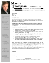
| Martin
has provided a wonderful cover letter he used--with much success--while
in Atlanta for a summer run of a show. I love how the "review" blurbs
are off to the side, in grey, in a very "Martin-like" vibe. There's a
sense of corporate formality with a dash of industry savvy, here. Very
nice work, right down to the mini-me headshot in the top left corner.
Of course, y'all know I love the bullet-point list, as anyone who
doesn't have the time to read the whole letter can at least see the big
ticket items. I love that Martin discloses that he lives out of market,
but travels into the market
regularly for paying work, hence his interest in local representation.
This is a fantastic letter for a minor market actor! |
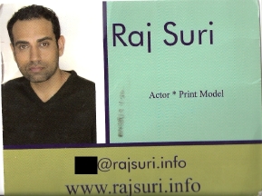
Raj
sent me a promo postcard he uses and I think it's pretty good. Not
great, but good! The colors are a little non-specific to a brand, so
that's one note for the next draft of these postcards. The font is
fine, but I'm not sure "actor * print model" is a necessary tag. I
mean, you're going to mail this card to people who would hire you as
one of those two things, right? So... they'll know. Better to use that
space with a tagline or great review--something that nails down who you
are and how to cast you, rather than something so generic. (Also, I'm
concerned that your choice--certainly not your first choice--of a dot-info domain name could prevent some folks from visiting your site. I'm told dot-info sites are often top-level restricted sites at studios, networks, and production companies.) (cont'd -->) |
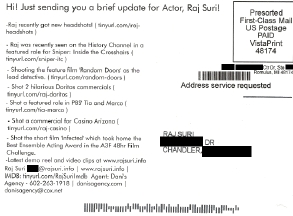
Raj packs a lot of information into his postcard, for sure, and he's chosen to use one of those printing services that keeps him from ever having to touch the card before it goes out (hence this one, that he sent to himself, being available for him to scan and send to me). I know some CDs who only keep postcards that have a little handwritten note (of substance--not just "hi"), but don't stress about that. Remember, just like I said above, this is all about billboards on the side of the road. We're going for brand recognition, and this helps. That said, I'm not loving the separate URLs for each item of interest. I think you're more likely to drive traffic to your site (where you can teach us how to cast you and always be sure we know how to contact you) for follow-up information if it's just one link, and then all of the juicy details (no matter how long we've held on to your postcard) are right there. So, mostly awesome. I'd just trade some of the news for "how to cast you" details, for a truly rockstar postcard. |
|
|
||
 |
 |
 |
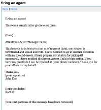
| Not a cover letter submitted, but one shared as a template at Hollywood Happy Hour last week, when a member asked about agent drop letters. I would never say anything about going "another direction in life," when dropping an agent, as that's only appropriate if you're leaving the business altogether. Calling out a "life change" when all you're doing is changing agents seems disingenuous. Also, please, never use apostrophe-S to make a word plural. Please! The above example uses "photo's" and that means a photo possesses something. Humor me. Choose proper grammar and don't use an apostrophe to pluralize anything. If you'd like some tips for letters in which you drop your rep, please start here. Thanks! | Elizabeth reached out to me saying she wants to be sure--as she approaches an agent to add to her team--that she's covered all Three Ps
"without going overboard" into something not quite professional. I
think what we have here is a letter that shows you've done your
research about who the agent on the receiving end is
(at least via his social networking personality) and you're engaging
that person without being too familiar. I'd edit out all of the cliché
"take my career to new heights" things, as all agents and managers know
they're being approached because they could, possibly, help you with a
tier jump. You need to focus on how you serve them,
not how they serve you, for a stronger approach. A super nit-picky note
is to bring the period outside the close-parentheses in your second
paragraph. Otherwise, pretty good! And not overboard at all. |
Here's a great example of a "short and sweet" cover letter. Yashar shared this letter he sent to a top TV casting director a few years ago. Super short, which is great, but there's not much personality bubbling through. Of course, you may not be the "bubbling personality" type, but even so, there should be a vibe coming through that tells us something about what we're going to get, if we do take that opportunity to meet with you. And on a letter this short, I'd consider using something like the mini-me headshot, absolutely a URL listed somewhere, and certainly a blurb from a great review, perhaps received while you were in college. Lots of options! I'm also a huge fan of specificity. So, saying you believe you'd be a good match for the shows this CD casts is a good thing. Saying why you feel that way is a better thing. Including examples of roles you have played that prove you are right is the best thing! |
|
|
||
 |
 |
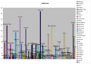 |
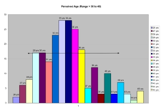
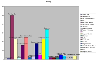
| Finally, Devin has rocked my world. No, this is nothing you'd ever send to an agent, manager, or casting director (but certainly something you'd use to inform your mailings, and--once a team is assembled--something you could review with them, to be sure you're targeting roles correctly). (cont'd -->) | What Devin has sent me is a lovely nine-page print-out (these are just three of the pages, of course) that comes from his typing exercises, conducted via my previous columns on TYPE and follow-up work with Mark Atteberry on the same topic. I think conducting type surveys is something that is so easy, so effective, and--once it's done--something so good for your foundation, in marketing. (cont'd -->) | You don't need to let these sorts of details rule your life, but it's so liberating when you've begun to discover how the industry sees you--and therefore casts you--because you can work with laser focus, rather than a "scatter shooting" approach to all of the roles and projects (and people who cast them). I know not all actors feel the need to create a Google survey or Excel spreadsheet of such info, but even scrawled in a notebook, a list of adjectives will help you as you develop your marketing materials! |
|
|
||
| Remember, a cover letter is a part of your marketing package. You're showing the industry how to get you from the font you choose, your writing style, and the length of the letter itself. Have someone else read your letter. Does it "sound" like you? Then you're on the right track. Promise me you'll have someone else read your cover letter, if for no other reason, to proofread one last time. PLEASE! | ||