|
Click on any still to launch the .mov demo reel
file associated with it.
|
|
 |
 |
 |
| Kalimba's reel
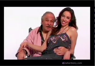
is pretty good. SpeedReels seem to save your name 'til the end
and offer no contact information whatsoever, which you'll see me harp
on several times in this week's column. At least
give me a URL
so I can visit your site for more info, if I'm watching your reel on my
local drive or away from your site for some reason. I generally like a
show title (or film title) in the lower-third of a clip (just to let me
know what I'm watching), but because only your first clip has one, it
feels out of place. I'd lose it altogether, if you're not
going to do it throughout. I'm not entirely sure, but the last clip
(the job interview) seems off-brand. I'd lose that clip and end
with the "unit with my class" scene. It's funny and I wanted more. Not
a
huge fan of the cooking show clip in which you're wearing a wig. I'd
either put that after the eHarmony spoof or lose it altogether.
Still, these are nitpicky issues, seeing as the reel has two of my
favorite components: It's SHORT and it edits a series regular down to a
supporting player in your
scene. Seriously, Lisa Kudrow supported you very well in YOUR scene.
That's exactly what good reel editors can make happen! |
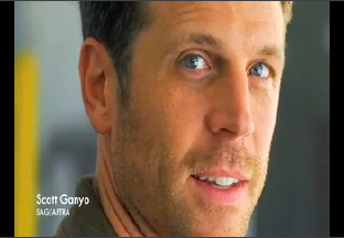
I
generally like Scott's
reel, but I have a question. How dated is that priest clip? I love it,
but I worry it's not your current look or brand, so to lead with it is
a bit odd. Maybe save it for a clip after something in your current
look/type area. Also, the music cuts out too cold on that clip. The
blowhard clip is good. The Comedy Central clip, I'd lose (or save a bit
of that for a montage at the end). The scene in the room with the bugs
is over the top, but that may be a character (and brand) you go out for quite a
bit, so of course, you need to keep that too. I don't like the
no-dialogue razorblade clip. It's just not necessary, and could also go
in a closing montage, if you really wanted to keep it for some reason.
Love the cute kiss ending scene, but it cuts out just a hair too soon.
Leave us with a bit of a button and the moment after, so we can let it
sink in. Not too
long, of course. Oh, and I adore that your opening card is your
headshot--so we know who we're checking out, right away--and your name and
union status. Overall, well done!
|
Okay,
Brandi
got work on
a reality show, which is more and more common for actors these days,
but I'm not thrilled with how you've chosen to present your work on
that
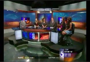
show as a showcase of your acting ability. I think it's great that
you--out of all the folks that participated on the show--were invited
to do press with the show's host on a local news show, but that's
something to mention in a cover letter. Or it's a blurb on your
website, along with a still from that visit. As a clip, it's just not
telling me anything about you as an actor. You could use a bit in a
montage at the end of a reel, perhaps, and use the clip from the show
itself on a dedicated reality show/personality reel (not an acting
reel), but to use this whole news segment is overkill. It's of greater
value as a mention, rather than as a full display of how the show was.
That said, I know you're using placeholders until you get your footage
from actual acting work you've shot, so I get the why and trust
you'll yank this as soon as you get more substantive examples of your
acting chops.
|
|
 |
 |
 |
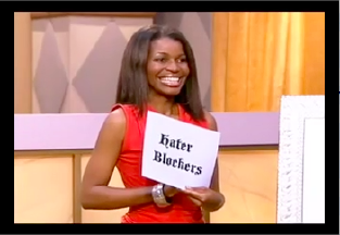
Here's
a great example of a reality show/personality reel from Chanté. The
footage is re-edited to be all about you, which is exactly what I'd
hope you'd do, no matter where your footage comes from. This has
nothing to do with the way the show aired and everything to do with
showing us who you are. Excellent! The only thing I'd recommend, here,
is removing the clip from the film in which you play a TV reporter.
It's mixing messages. You've given us three reality show/personality
clips and then one that is of you, acting. Sure, you're acting like a
reporter, which could
go on this sort of reel, but because it's you portraying a role rather
than hosting a show, I think it needs to go on a separate acting reel
(one which contains no reality show clips--except perhaps in a montage
at the end of the reel, if you must). Still, a fun reel and one that
helps me get you.
|
Now,
Lauren's
reel is
not my favorite, for one major reason. It's one long scene from a
project you did, with no editing to make it less about what the
producers needed it to be and more about what you need it to be:
showing us YOU. There's a full 20 seconds before we even see your face.
It's mostly black screen with voiceover, which isn't horrible, but it's
just not helping you as much as it could, re-edited. I'd also edit the
guy walking down the hall to a fraction of the time we spend on that
otherwise. Take this aircheck scene to a great demo reel editor and
have him make it all about you. Also, add your name and contact
information, so we know who you are and where to find you. It's fine to
only have one scene on a reel (especially one that aired on a major
network), just present it at its best so we see you at your best.
|
Brant
asked me whether it's better to have no media clips than
to showcase work that's "nothing you're really proud of." Yeah. The
answer is yes, Brant. I'm sorry. I can't find much to love about what
you're using as a reel right now. No name, no contact info, no headshot
at the start so we know who we're looking at. Can't be sure whose reel
it is and at some points I'm pretty sure it's the female actor's reel,
the way it's edited. I don't get to see much of your acting at all,
which is the point of a reel. I'm going to show you a great example of
the kind of reel you can use to show folks what you're about before you have
much usable footage. Yes, you'll need some footage but I bet you
can grab a camera, some buddies, and iMovie and do better than you might expect!
|
|
 |
 |
 |
Ah,
I adore Zurit's
reel, although it's less of a demo reel and more of a "sizzle reel."
This is what actors who have very little material should consider
trying, as they build up tape. No need to push to include a bad scene,
a one-line role, non-sync sound/non-speaking pieces when you can
create a "best of" that gives us a sense of how to cast you, and enough
to maybe get you in the room. Until you have more substantive clips--or
ones you're really proud of--this is a great alternative to the "all or
nothing" dilemma many actors face. Love your use of music and how you
have it go quiet but not all the way out, for a line here and there. My
only tweak would be to have the reel start on your line in the
restaurant. I know you want to establish the scene a bit, but less of
his line could do that just fine. Great work!
|
I
like that Tara's
reel opens with a headshot, agent information, and website URL. What I
don't like is how most of the footage in your reel is shot. Everything
is your coverage! So, either this was all shot for the purpose of a
reel (which is fine, when done well) or you chose to use none of the
establishing shots or cutaways, which seems odd. That's fine for one
scene, if it's all you've got, but when you're giving us a lot of
material that's all shot as if it's "just for you," we're seeing no
professional work and too much of the same thing. It's not helping you
as much as just having one "shot for the sake of a reel" scene would. I
feel the last scene is the strongest of these and should go first on
your reel (or at least right after what is currently the first scene).
You could edit down the time spent showing the phone and bringing it to
your ear, but that's a nitpicky note. |
I
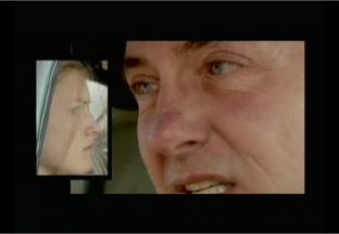
love the exhibition scene that is the first clip of Lee's reel.
Totally great branding and some high-profile stuff. The build and quick
emotional switch in the scene in the car is intense and fantastic. The
third scene is good. Fourth one is well-edited to be all about you,
which I love. After these four scenes, I fall out of love with this
reel, which is okay, since many folks won't watch more than a minute of any actor's reel, if it starts answering good
questions right away (which this one does). I'd lose the comedic clips
on this reel to stay more on-brand with what is clearly your strength.
If you have enough to create a separate comedy reel, that's fine, but I
don't love the comedy in this reel. As for the gun-spinning/no dialogue piece,
that'd be a great closing moment with your name and contact information
superimposed. In and out and totally on-brand!
|
|
 |
 |
 |
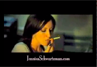
Jennica's
reel has a few problems, for me. One minor problem is that her name
(used in URL form, which is handy) is in the lower-third at the
beginning of the reel, which may go away before the video player
controls hide themselves, thereby obscuring that info. Another: Editing
your rep's contact info into a reel is always tricky, because it's
unlikely you'll be with them forever, and that's another trip to the
demo reel editor, when you make a change. Further: The music that plays all
through the opening montage cuts out too abruptly for my taste. And... I'm not
crazy about the "nobody ever wants to go to bed" scene. I think the
look could go into a montage--something you clearly love using--at the
end. Oh, and I'd way minimize any montage you feel you must use at the
beginning of a reel, as many folks hate 'em and will just stop
watching. Save montages for the end, to avoid that situation. Otherwise, good
stuff and in a good order too!
|
Love
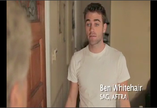
that Ben's
reel starts with him answering the door in his jammies. When he closes
that door, we cut to a phone slamming down. Really nice edit. I liked
everything in this reel--especially the "see ya later" jump and run
after the closing info card (nice touch, for those who stick around and
watch longer than you might expect)--but the sound on the "wife's
accident" clip needs to be bumped up to match the levels of the other
clips. Actually, the more I watch this, the more I'd like to see
this material re-ordered. Maybe the estate sale
followed by the wife's accident, then the black and white clip, ending
with the hard bargain (so the estate sale bits bookend the more
dramatic content, rather than threading between). But overall, a great,
well-branded reel!
|
I
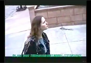
really do try to find something I like about every reel, but Pamela's
just didn't give me anything to love. There are references in the
dialogue to the line across the screen (about THEnevermoreNETWORK), but
I don't understand at
all and I'm not going to call the number to find out. Yes,
I did Google, though! And if this is supposed to be public access
comedy, I'm really scratching my head now. The edits pop in the audio
(and not in the good way) which means they were either done by an amateur to begin with or via
pause button on a VCR to create this reel. A kitty meow for the
foul language bleep? Huh? It's all just pretty awful and I wasn't sure who to
look at until I went back to your email to visit your profile and see
your headshot. Not good. This falls in the category of "lose it 'til
you have something much better, and even then, use as little of this as
possible." Sorry. :(
|
|
 |
 |
 |
I
actually really love Ron's
reel. I'm so inspired when I see out-of-market actors with reels that
could compete with--and surpass--those I see from LA actors every day. I love that
you include info about the projects (including awards) in the
lower-third. This is all good, well-branded material, always starting
on you.
And the montage is saved for the end to show more, but after the work
has been consumed! Just awesome.
|
Stacey's got such
great materials! Good opening, good use of music as intro and then
under the first scene (though it doesn't "go" with the scene very well,
especially since it sounds like you bring it back in the "I want to
have sex with you" scene with the guy in the bad wig). Honestly, there
are some edits that would make this reel much tighter and more
pro-level, but it's good already. Nice button at the end. I'd leave
the text up a bit longer for those who don't hit the pause button
before starting to write down your info, but that's one of those nitpicky notes.
|
The
problem with Valerie's
reel is that there's very little to tell us it's yours. While the first
scene is fun, there are five people in it and without a starting still
on you (via headshot or clip), we're not focusing on you like you'd
like us to. I'd fix this via re-editing. I'd put the hand-raising scene
first so we know (more likely) that it's your reel. Next, would be the
dog scene. Then the self-injury clip. The in-studio/audition/class
scene? I'd lose this as soon as possible. Until then, I'd edit out the
reader and class applause if at all possible, as it's pretty distracting.
|
|
 |
 |
 |
My-Ishia
has a pretty good reel! I like using the lower-third as a way to share
the project info. You never know when that will be relevant to someone
viewing your reel. I also enjoyed that you started off with a high-profile
quick clip, then went into a title card for the reel, then the rest of
the content. I think, overall, you're generally well-branded in this
reel, but it's 60 to 90 seconds too long. Some of the face-cutting
footage isn't great (mostly due to failing special effects makeup on
your scene partner, at times) and I would lose the music video
altogether--or put it, along with the non-speaking clip with the
children--into a montage at the end. It shows you have more professional-level footage,
but doesn't diminish the value of the higher-profile footage that you
currently have surrounding it.
|
Okay, Ana!
Let's get to
it. This is certainly a starter reel, and really, it's not worth using
as-is. You've got some good acting going on in that grief clip, but the
music is overwhelming in places and it needs a ton of editing to be
useful as material for a reel. Why are you whispering in the second
clip? I wonder if these weren't shot in an acting class. Not that
that's horrible, but it's not reel-worthy. If you're shooting your own stuff, it must
look GOOD. Take a look at other reels--start with those on this
page--and get a sense of composition, sound, editing, and lighting
that's required at a minimum, for professional-looking material.
Finally, the last scene has some funny, well-written stuff about
waiting room games, but it's just not shot like anything on a reel
should be. You've got some homework to do. From your email, I know
you're willing. :) Dive in!
|
Elizabeth sent
me her very first reel and after looking at a very first reel, I have
to say, YAY! :) Good start with the headshot and name (and at the
closing too) and I love that the audio of the first scene begins before
we're off the headshot. Very nice touch to establish environment before
we're on you, via the shot.
Yay to your editor! Titles in the lower-third are cool, as I've
mentioned already. The music is a wee bit too loud at places in the
first clip, but that's a minor tweak and honestly not a deal-breaker.
My best note is that you've made good use of re-enactment footage--and
that's hard to do! It's good to use it sparingly and at the end of an
otherwise actor-clip filled reel, which is exactly what you've chosen
to do. Well done! Great first reel! |
|
 |
 |
 |
| Zelika's
reel is just one scene. That's fine, when it's done well. I'd add an
establishing shot of you or a headshot--something with a title card
including your contact info (or at least an end card like that)--so we
know who we're watching, in case we save your reel locally and watch it
later. I'd say you could edit back some of your co-star's dialogue to
put the focus more on you, without losing much of the scene's meaning.
Still, this is generally good, short, and well-branded, which is what a
starter reel should be. |
Terry's
concerned about keeping himself out of bad guy roles by showing too
much range in this reel. My notes: Need a title card. The reel is way
too long. There are sound issues in the "marriage was over" scene. I'd
lose the "swirling wine" scene altogether. The "welcome brother" scene
is okay. All of the restaurant scenes are of such
low quality, I'd never use them. The toast with the kiss on the sofa is
filled with sound issues and isn't on-brand for you. "Enjoy the rest of
your day," spoken by another actor? Lose the clip. You don't speak in
it! The tuxedo in the alley clip? Out! "Files are missing" scene, out
too. I don't love the "Mrs. Winston/go to the spa" scene at all. It's a
bad ending to a reel. Basically, you're trying to tell the story of
this film in your reel, rather than selling your
best work. If you can re-cut this to lose all scenes with tech problems
(a lot of them) and make it all about the sleazebag you so totally
nail, as a type, you'll have a much shorter (under a minute) reel that
sells your type perfectly. Including the bad guy.
|
Ah, Melanie.
I adore you! My biggest concern with this version of your reel is that
it's got you sporting a ten-year age range between the first and last
clips. Sure, the older footage (of you, younger) is at the end, which
is fine, historically, but it might
be time to lose the closing clip (but not the one before it, from the
same series, strangely enough, because you look older there than in the
final clip), even though it's a brilliant button. My favorite thing is
the "like" theme your editor pulled out in piecing together a few clips
in the middle of your reel. Hilarious example of an editor--and
you--having fun with what you're doing. I'd be sure to add your contact
info--at least your website--but otherwise, a homerun, just like I
expected from one of my favorite actors on the planet! |
|
 |
 |
 |
Christa is hoping to have "LA standard" materials before moving to LA. This is a good
out-of-market reel, with industrial footage edited to be all about you.
Will this hold up in LA? Only a little bit. You're going to have to
have some acting footage (not that corporate/non-broadcast isn't acting, but it's not a co-star on CSI
either). I'd suggest moving things around a bit, for now. I'd go Cisco,
then the direct-to-camera clip you currently end with, then the Santa
Cruz Film Festival ad, and end on iChat (or cut that one altogether).
That puts your most "actor-y" stuff up front, which is better for the
LA market, 'til you have student films and other narrative projects to
include. Also add some contact info--at least your website--in the
opening or closing card. Otherwise, really good stuff, and a nice model
of corporate/non-broadcast reel footage for other out-of-market actors!
|
When I saw Jim's
reel, I actually stopped and said to my husband, "Man! It's so nice to
see out-of-market actors doing seriously LA-ready stuff with their
materials!" This is evidence of our world getting smaller and
information getting more accessible (Thank you, Internet!) and actors
being more open to pushing outside of their comfort zones. Very strong
work, here. All edited to be all about you. Toward the end, there are
too many single shots (no environment), so those will be the first to
go, as you continue to edit in bigger/better stuff and lose the less
awesome stuff (like the journalist's inverted pyramid structure for
writing--be ready to lose what's at the end), but that's a great
structure to have in place. The reel is short, which is great. I'd just
add in your name and some contact info (at least your website), but
otherwise, this is rockstar good! |
I'm going to assume Jonathan's
reel has a watermark from the demo reel editor because it's still "in
progress" and the editor doesn't want it out there 'til it's fully paid
for. Fair enough. I'll try to ignore the watermark, then (as OMG, if
this actually lives on the finished reel, that's suck-tastic and like a
headshot photographer getting a photo credit on headshots you paid for.
Ick)! LOVE this reel. LOVE. The interrogation scene is edited to be all about you. Jailhouse negotiation is excellent and edited well. MadMen
I'd cut before the handshakes upon exiting the room, and go to the
walk-and-talk part of the scene. Montecito Hotel scene, I'd put later.
Astronaut scene is nice but the music feels a bit on the nose. Consider
editing differently. Love the Walmart greeter scene. So on-brand! The
following couple of scenes are not great. You have better, so it
makes me want to lose these, or relegate bits of them to a montage. I love the Matthew Weiner voiceover (but not the other, unidentified VO) from the MadMen
DVD. That's nicely done--both in terms of getting the praise and using
it in the reel. (Yay, you!) Maybe put that after a closing card with
your contact info and/or URL, so it's not seen as masturbatory by those
who don't love it. And I'd give just a beat more after "he's a genius,"
for the button to set. Overall, awesome, though. :) |
|
|
| Remember, your demo reel is the
trailer for the movie that is you.
Leave us wanting more. Show us how to cast you. Lead with your
strongest stuff (and that could be the highest-profile, the biggest
money-earner, the largest role, or--most importantly--the most
"on-brand" of your work) and always take the advice of a pro, when he
or she tells you you're lingering on anything a bit too long. Avoid the
scrapbook
syndrome.
You are the only
one with the emotional attachment to each and every clip.
When your reel is great, we notice the acting. When your reel has
problems, we notice the problems. If you think like a producer, it
becomes very easy to see the point of
a reel: To show us what you're like on screen, to let us hear your
voice, to teach us how to cast you next. |
