|
Click on any still to view a larger version of the
website screen cap.
|
|
 |
 |
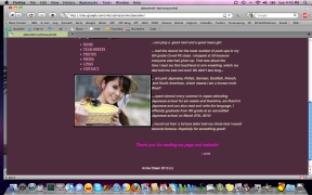 |
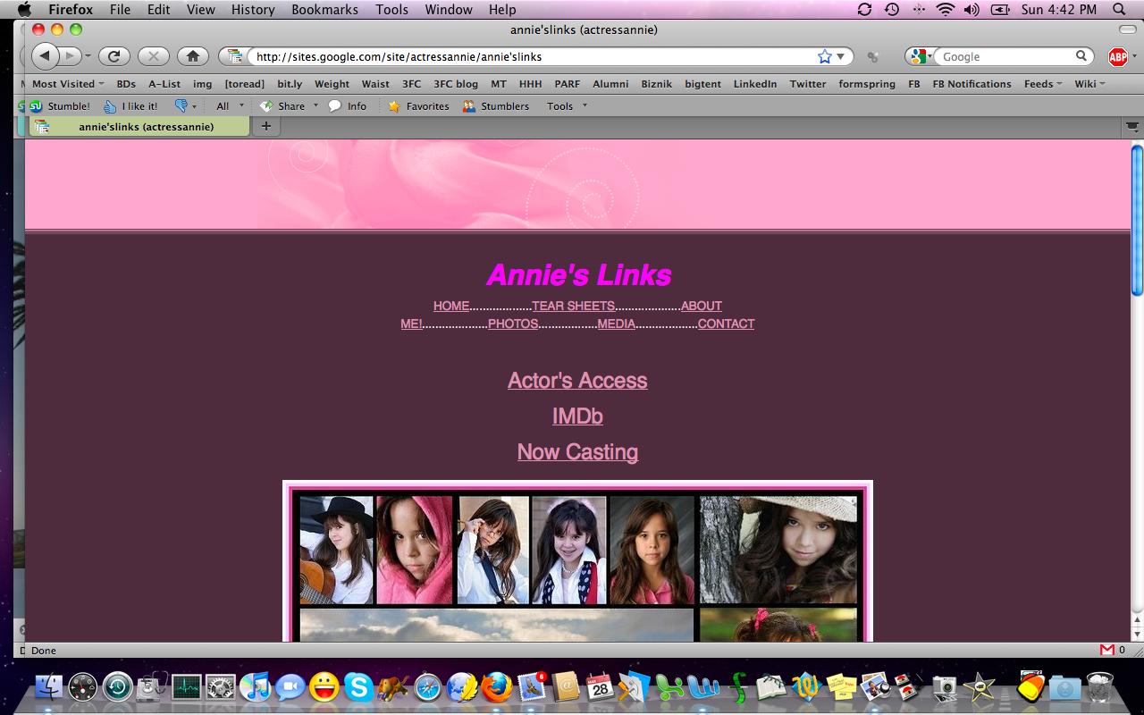
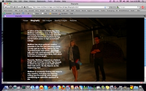
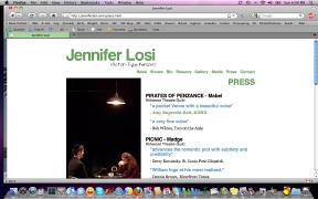
| My
biggest issue with Annie's
site is that the menus are jumbled up all over the place. On one page,
they're grouped up top, and on another, they're on the side. Visual
consistency is a good thing. (Also, watch out using punctuation marks
in file names. Some servers won't like annie'slinks.html
and will return a 404 error. |
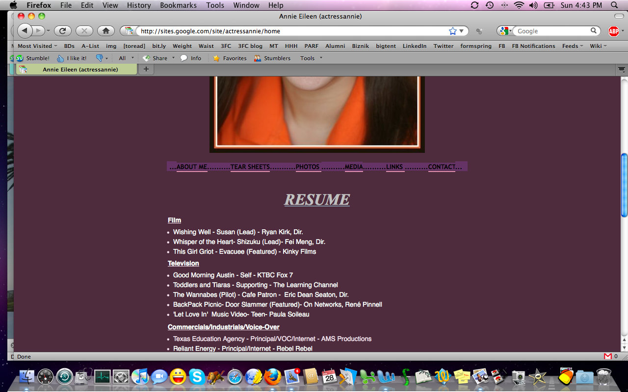
The
site, overall, is good, simple and seems to be age-appropriate while
offering good information. We need a printable resumé on the resumé
page, but I like the links to casting profiles at other sites as an
option 'til you get a PDF printable resumé up on the site. And someday,
set up a URL like firstnamelastname.com
and have it point to Annie's Google page or casting profile. |
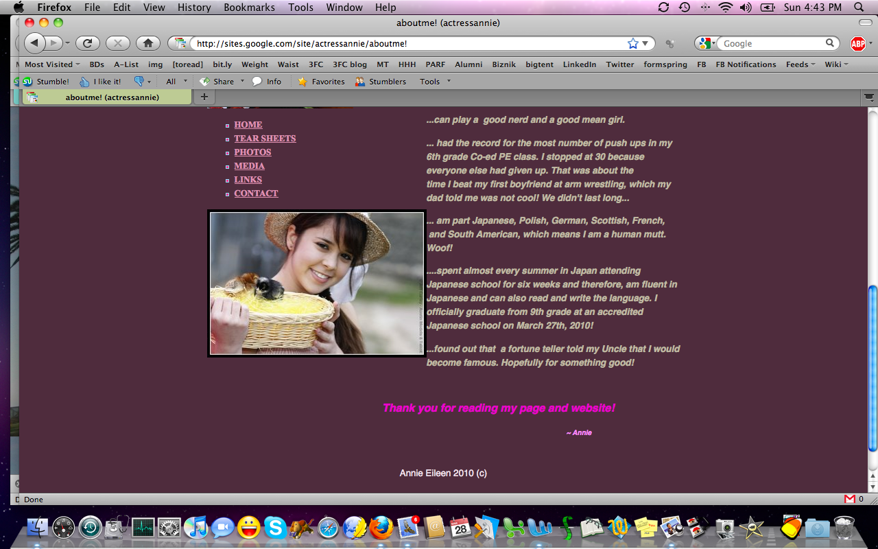
And
this is another page where the file name (aboutme!.html) could
be problematic. Ideally, choose a file name with no punctuation and all
lower case letters for the least amount of stress, no matter who hosts
your pages. |
|
 |
 |
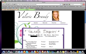 |
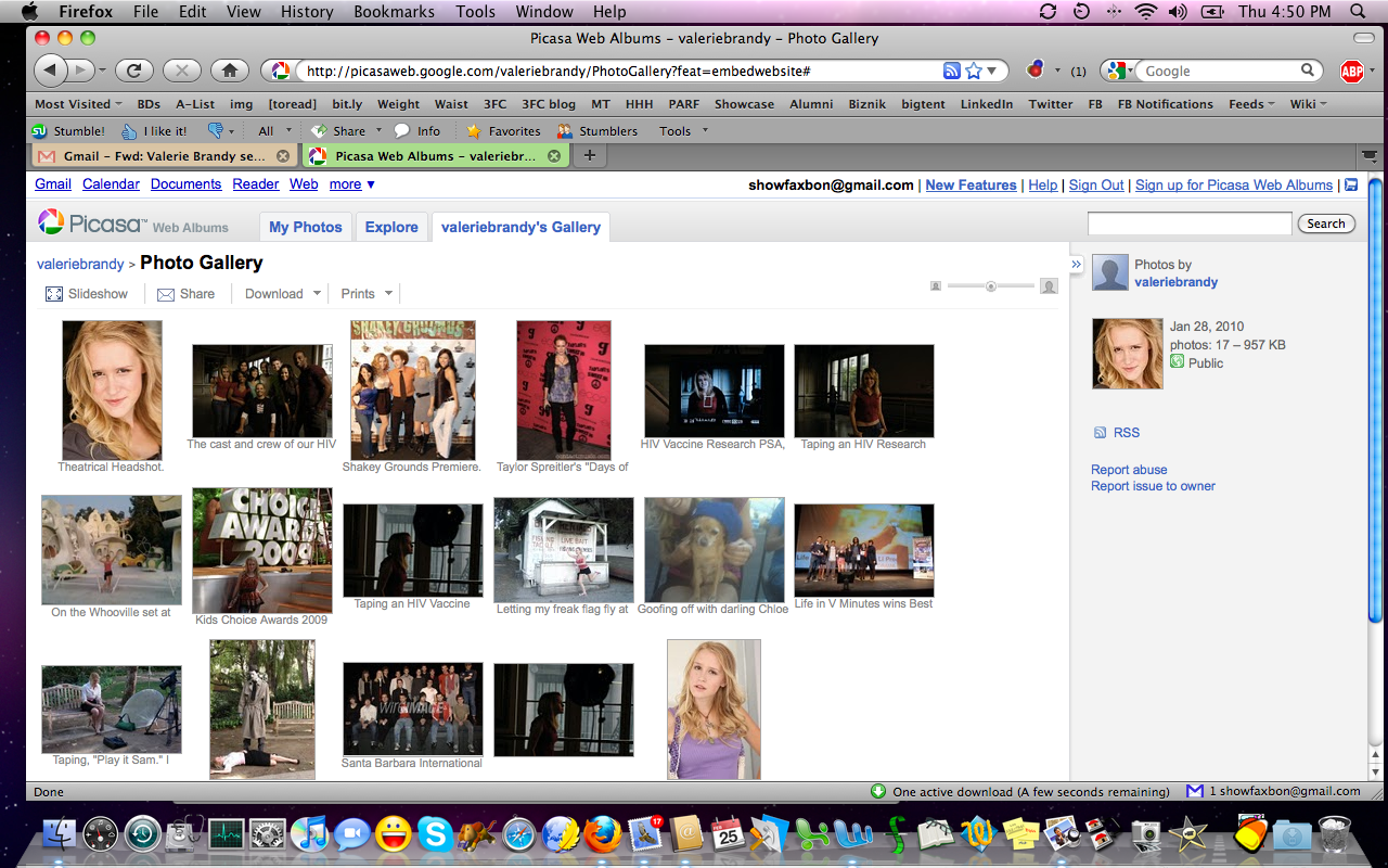
| Valerie's
site is so on-brand! Everything feels
like you and that's a great use of this marketing tool. I'd code the
<title> differently (right now, it's called contact and that's
easily changed within the <title>HERE</title>
tag to something more specific. |
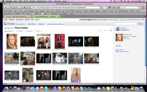
Your photo gallery is great! You're using Picasa to serve up the thumbnails,
rather than having to recode the website every time you want to add
photos to the gallery. You could do this with Flickr as well. Even a
non-private Facebook photo album would do the trick. |
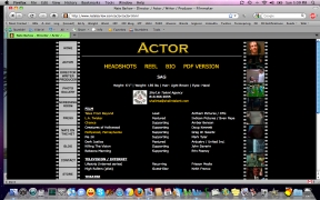
Another
very on-brand page is your resumé page. The problem
is, there's no PDF printable version available. Sure, I can right-click
and print out the image, but how many would go to that trouble (or know
that option exists)? Offer a PDF just to be sure everyone is served. |
|
 |
 |
 |
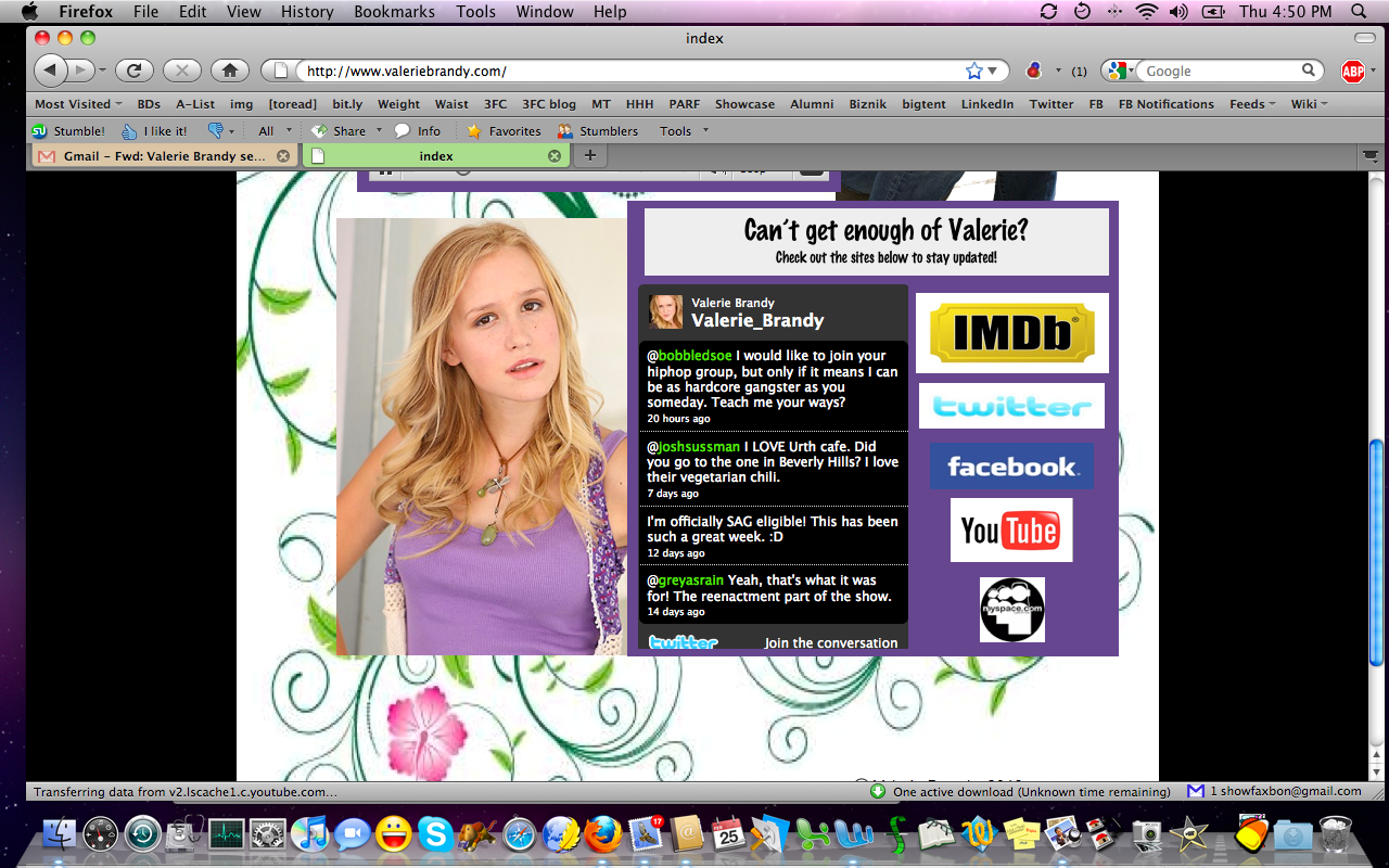
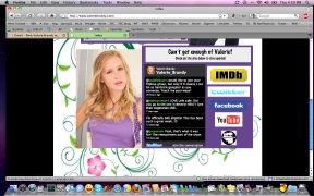
| Finally,
your use of a Twitter feed is very well-done here. Also, links
to your Facebook page, YouTube, MySpace, IMDb, etc., are all right
here. Again wish you'd recode the <title> to the page so it's
not so generic (that's also very helpful for Google spiders). Overall,
great
site! |
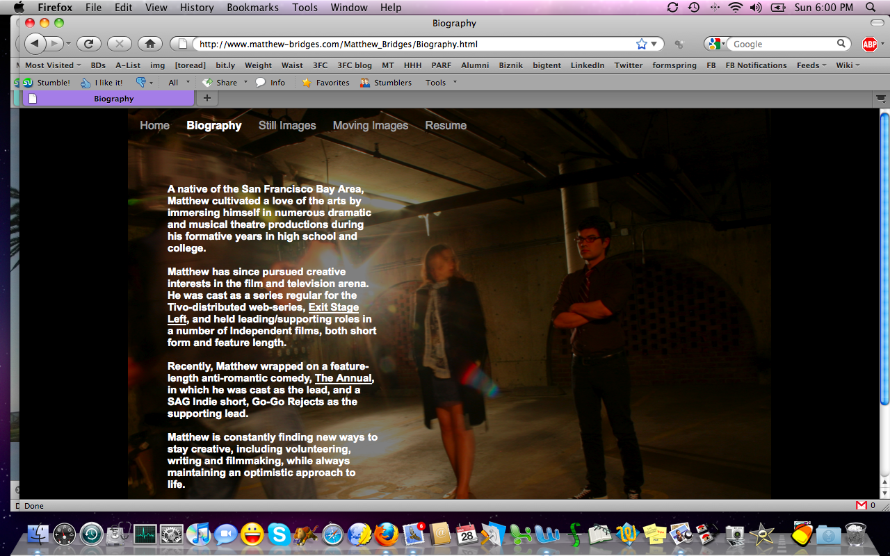
I
really like Matthew's
use of stills from projects you've worked on as backdrops for the text
on your pages. You've done a good job of balancing out where the text
will
land without having the background color fight for attention. |
A
problem I had with your site is that you don't offer a printable
version of your resumé, meaning this "toner dump" of black is what we
get when we try to print from your site. Bonus: Your name isn't on it!
Sure, we could figure that out, but just offer a printable PDF from
your site and that solves it. |
|
 |
 |
 |
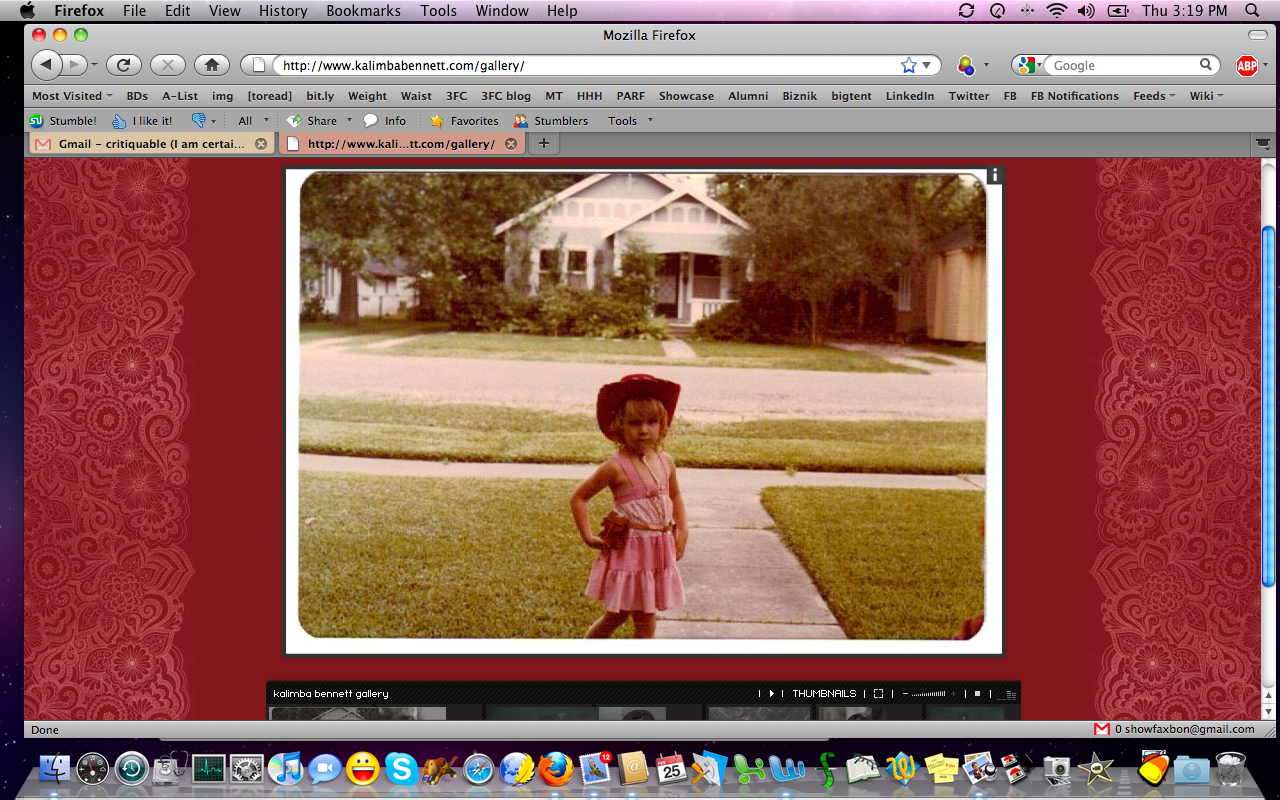
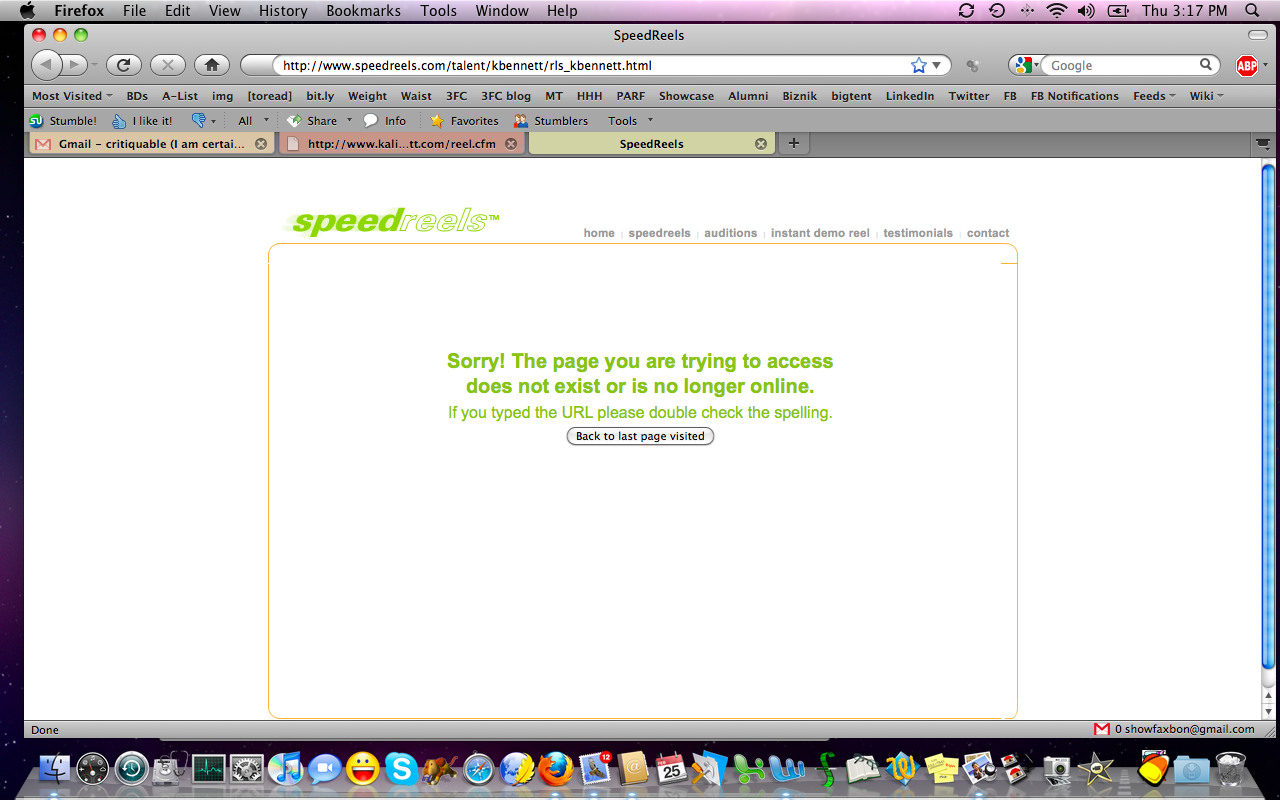
| Three
issues with Kalimba's
otherwise stunning site (seriously, it's wonderful). One: I couldn't
get the music to turn off. I tried. I clicked all over that little
control panel. Nope. Couldn't stop the music. That was annoying. Two: I
couldn't get any of the thumbnails to expand into full-sized photos. I
was so bummed! Every time I'd mouse-over the thumbnails, the gallery
would minimize. Boo! |
Third:
When I went to click on one of your badass demo reels, I was met
with this 404 error. So, this is a reminder to everyone to always
spot-check your external links and--ideally--host everything locally,
so your media isn't at the mercy of someone else's server issues or
choice to restructure storage or rename files. |
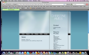
Christine's
site raises more questions than it should. A news section that hasn't
been updated in seven months is not a good thing--especially when its
last update was that you're waiting for the phone to ring! Also, it
looks like the resumé highlights in the right margin are all extra
work, right? So, if your site is advertising your services as an extra,
awesome. If you're looking to do principal work, that extra work has to
go! Also, this looks very template-y and doesn't give me a sense of you at all. |
|
 |
 |
 |
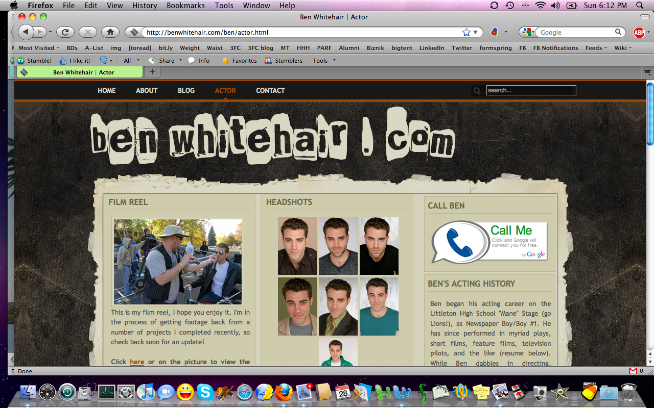
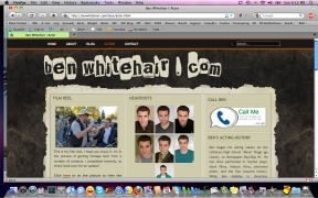
| So
much to love about Ben's
site! This is a good jumping-off page for your reel, headshots, contact
info, a mini-bio, and much more below the "fold." Love, love, love it
all! Well-branded, not too much clutter, and what's here is fun to read.
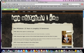
I especially love the bio with one sentence for each year of your life. |
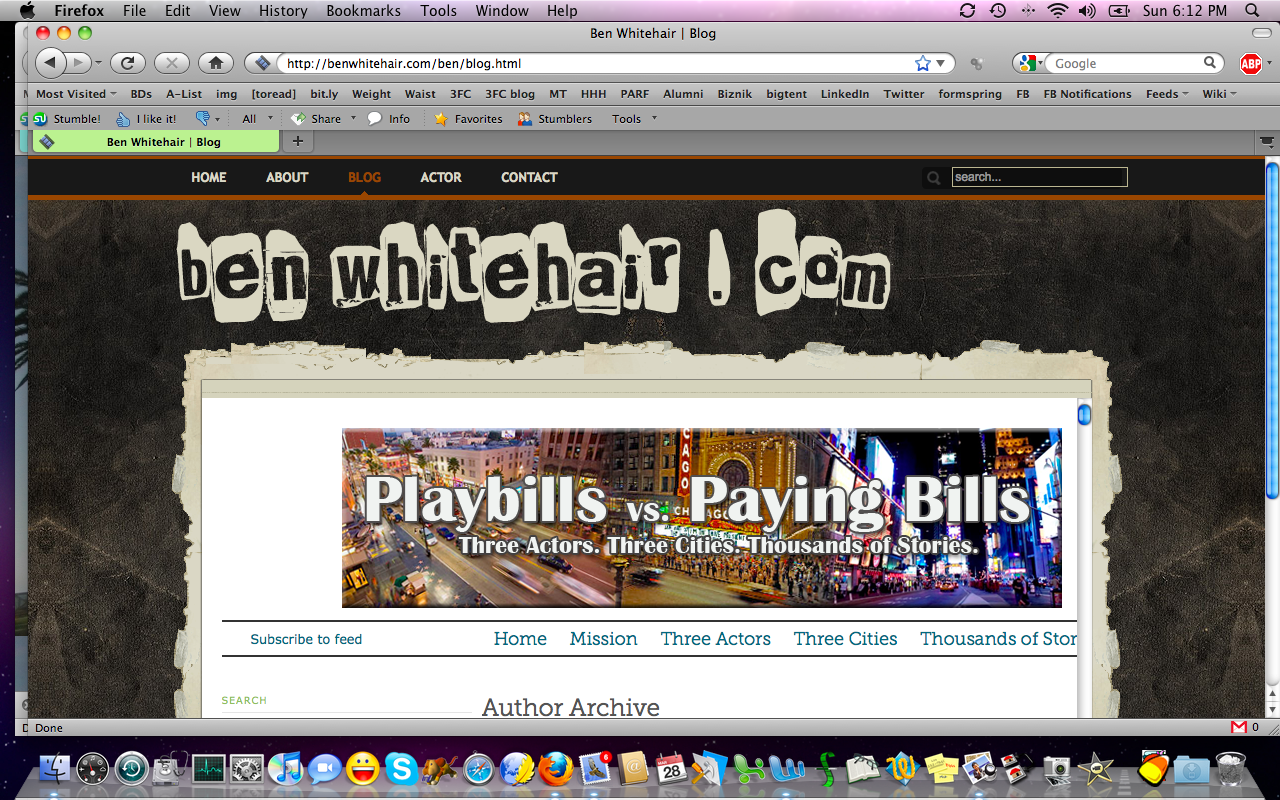
It's
hilarious and makes me get
you before we've met (I say that because I did read that page before we
met and then met you and found the vibe to be exactly the same). It's
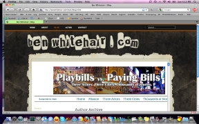
so much cooler than the usual ho-hum stuff! My favorite is
your blog, though, filtered here "by author" at a group blog hosted on
another site. Many actor blogs miss the mark. They're narcissistic,
rambling, or--worse--just dumping grounds of info copied and pasted
from other sites. |
Not
only do those other "actor blogs" that recycle casting notices,
articles, interviews, and booking blasts without attribution become a
wasteland for copyright infringement, they do nothing to brand the
actor copying and pasting 'em all. *shudder* Your blog is awesome!
Well-researched tips, interviews, and full-on articles that demystify
the process for your peers. Such a great give-back that bookmarks your
own resources while displaying that you're a smart actor! Awesome! |
|
 |
 |
 |
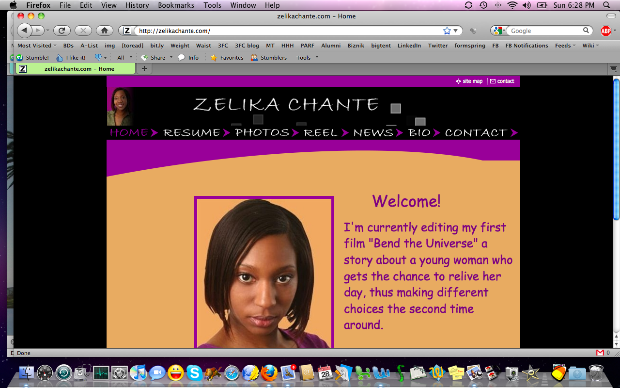
| Zelika, you asked
whether your site is aligned with your type. Well, I don't know you in
person, but I critiqued your reel last week and the colors of your
site, the font, the layout all feel a little generic and don't really
give me a sense of you.
Are these the colors of your favorite room in your home? Do you dress
in these colors? I'm willing to bet you could organically develop
something more you
if you looked at your website that way. |
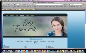
Tara's site
is generally good. The problem with her resumé page is that it's not
printable. Of course, you know I recommend offering a PDF printable
version of the resumé for download, because the above is how the resumé
looks on screen (of course, you can scroll to see the rest of it, when
you're actually at the site)... |
...but
the current "printable" version of the resumé (the above--a PDF taken
from the site, so if you click on it, you'll launch a two-page PDF
download) doesn't hold up well. The bulk of the text
is bumped to page two, with a huge run of blank space on page one. |
|
 |
 |
 |
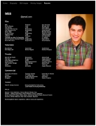
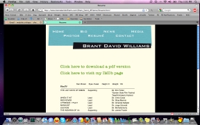
| Brant's
resumé page is good--I especially like the IMDb link and printable PDF
resumé option--but you should update your <title> HTML
tag to be much more specific. Right now, it just says resumé. You could
have it include your name. This is what our browsers use when we
bookmark your site! |
You
were concerned about how it looks to list too many auditions with no
bookings in a NEWS section. First, we aren't likely to read as much as
you think we might, in a NEWS section of your site. Second, we know
you're building relationships and these things take time. Take a look
at Stephon
Fuller's long-ass bio for a great example of how to feature
your everything
(classes, networking events, new ideas), not just auditions and
bookings. |
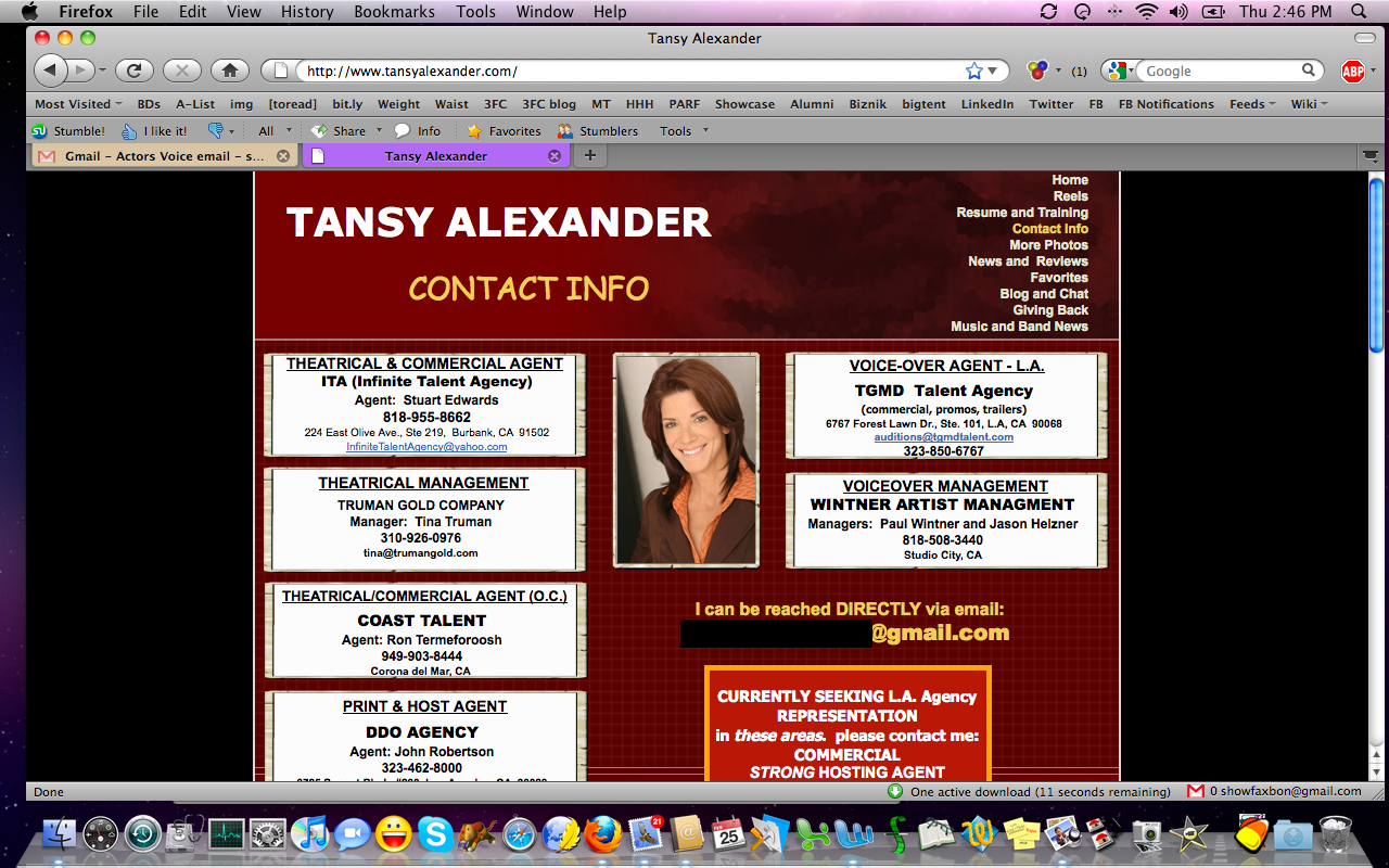
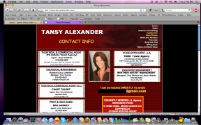
Tansy's contact
page is so cluttered it gives me a headache! It just seems like there's
too
much rep, here. And then a bonus: You say you're seeking rep in an area
where you already have
rep (LA commercial rep; the first one you have listed is LA commercial
and theatrical, no)? I'm confused. And really, you never have to say
you're seeking rep. Everyone assumes you'd always be open to an
upgrade, in this biz! Just seems cluttered, to me. Is there a way to
streamline? |
|
 |
 |
 |
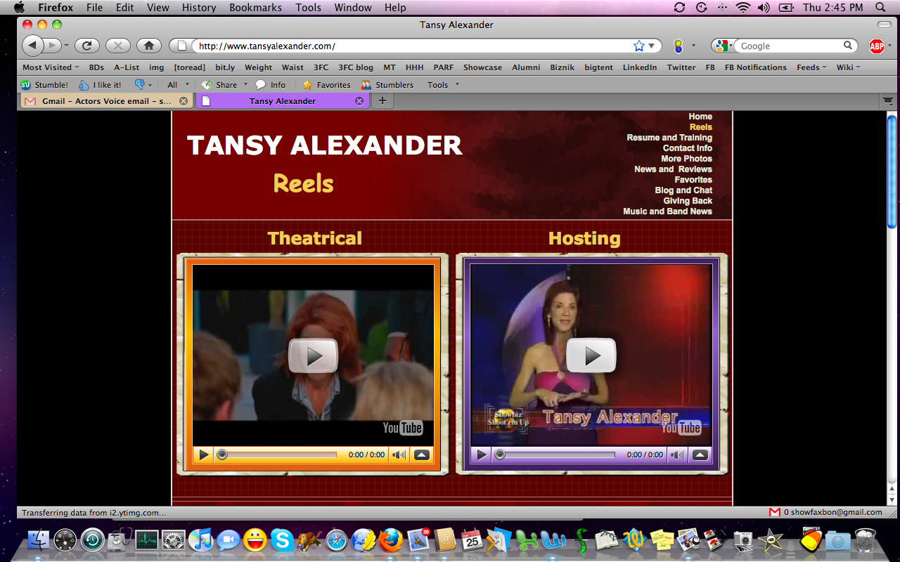
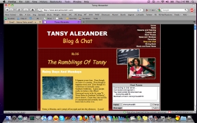
| A
cool thing on Tansy's site is her side-by-side reels, neither of which
auto-launches. Good stills showing us what we're gonna get when we hit
"play" on either--and we could watch on YouTube or embedded in your
site. The resumé page (not linked) is also very nice! Well-labeled and
easy to navigate. |
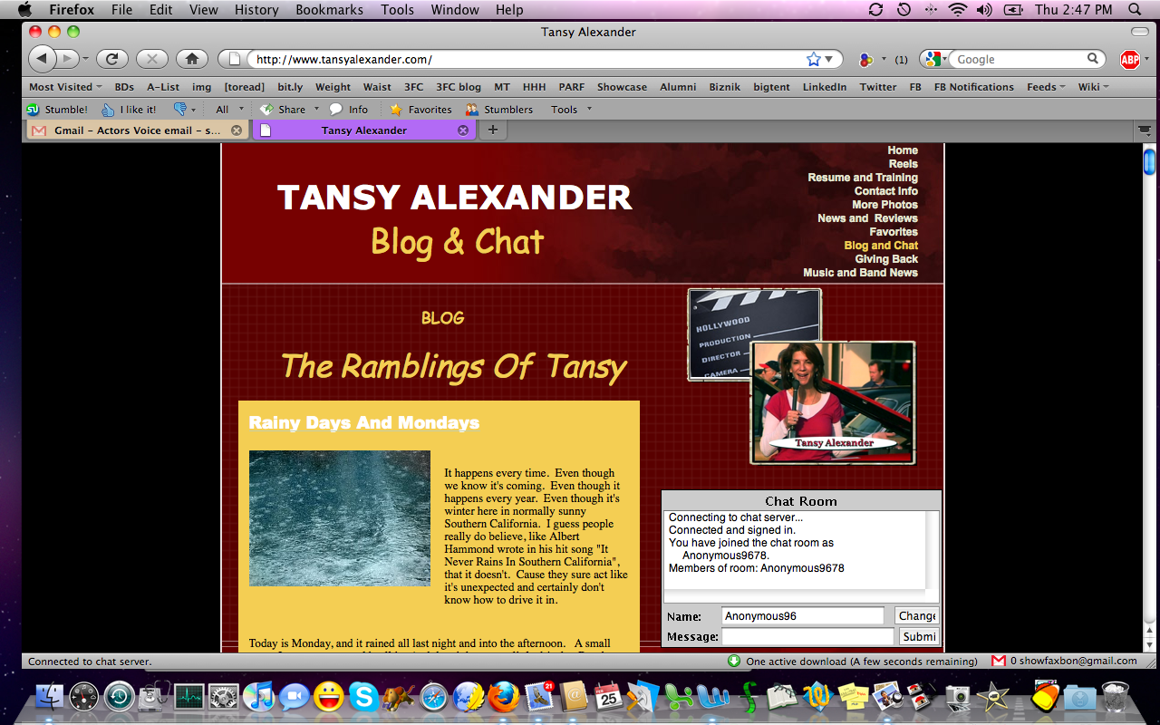
I
like the blog but I have to wonder about the chat room. Do people take
advantage of that? Do you offer regularly-scheduled chats? It seems
like a cool concept; I'm just wondering how frequently it's used. |
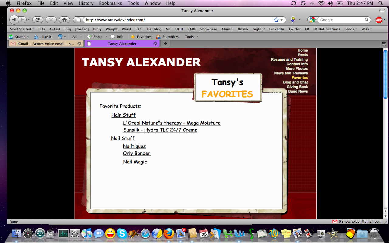
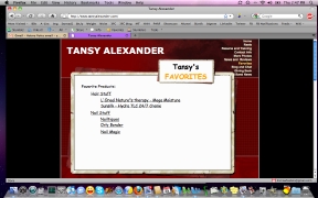
Finally,
I'm a little confused by "Tansy's Favorites." At least give us a blurb
about why you're sharing a list of products for hair and nails. I mean,
are you regularly asked what products you use? If so, say so!
Otherwise, this seems a little out of place for an actor/host site. |
|
 |
 |
 |
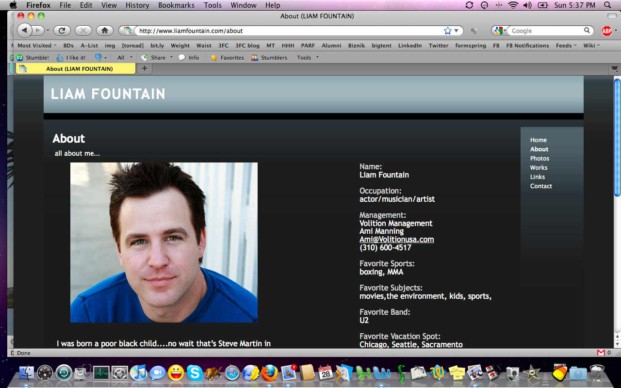
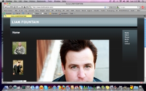
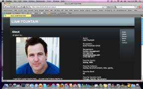
| Liam's
site is generally good, but it's heavy on template and light on
personality. I think we're at the point now where folks know enough
about web design (or can find a friend who does) to have sites that
feel more like them than like the template designer. |
The
"occupation" section on this page is odd to me. And on the main page,
you're dealing with--at least in my case--an issue on laptops. I can't
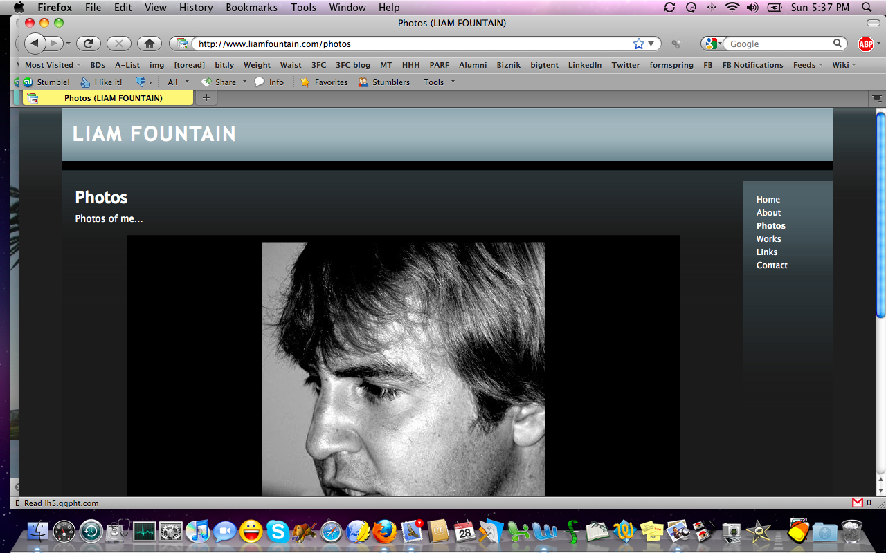
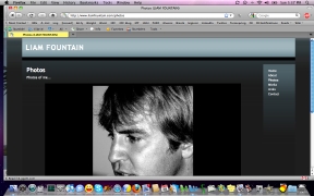
see your whole face! And then there's the photos page. The slideshow
starts right away, goes fast, and leads off with... |
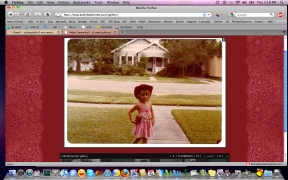
...a
very old
photo, not so much on-brand. I'd rather a bank of thumbnails so I can
choose which shots to view, and that's not an option here. Also, I'd
relegate the band photos to another area of the site. They're
interesting, but they're not selling the actor brand. |
|
 |
 |
 |
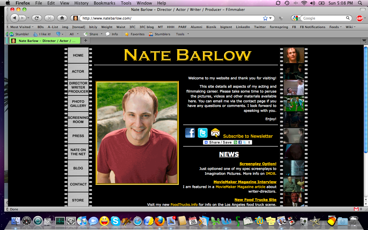
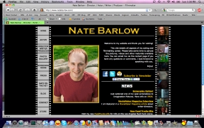
| Nate is a
hyphenate--and you know I love that--but I want his actor pages to be
distinctive. Maybe the director pages could be a different color or
font or format, but still on-brand. Think of how Diet Coke and Coke
look alike, but they're not identical.
That would help me feel I'd traveled out of one area of your page and
into another, which might be nice. |
There's
got to be a way to create a still on-brand site that gives us a shift
in feel for each career, because if you think about the visitor to your
site, he or she is probably not coming to find "the total package."
It's for one thing or the other. Also, while the food trucks site may
be fun, it doesn't feel like "news" to me. I'd consider putting it
"below the fold" or in "fun facts."
|
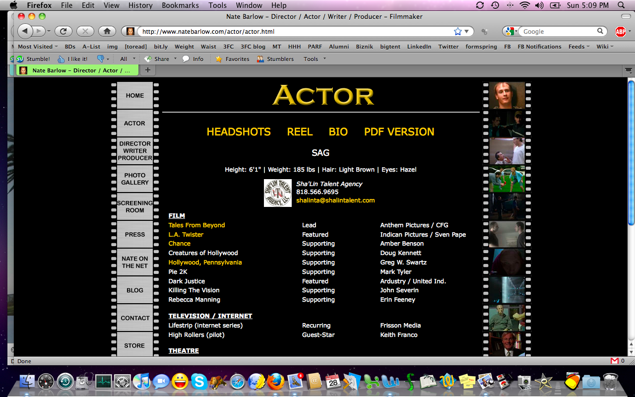
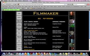
If
you do end up breaking out your site somewhat--like making the
filmmaker page look somewhat different from the actor page--also tweak
the <title> tag in your HTML so you don't have the big,
long list there. Yes, you're a hyphenate and that's awesome (and more
and more common), but when you ask yourself who's visiting your site,
you get better design answers. |
|
 |
 |
 |
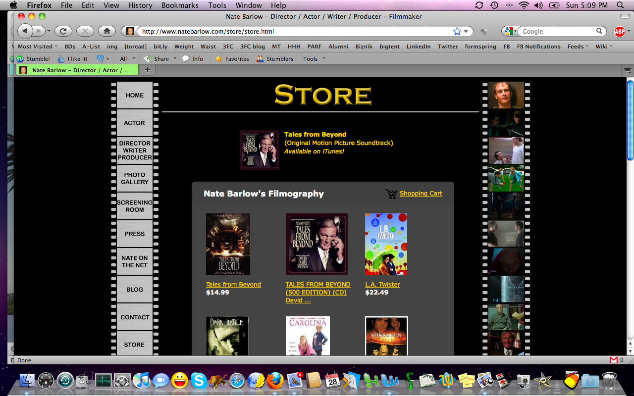
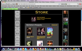
| Finally,
I love the store at your site! It's a great way to keep all projects
you've been a part of just a click away. I do something similar with a
poster gallery on the Cricket
Feet Casting site, but this is really fantastic! Very nice
touch. |
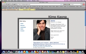
Kimo told me he was hoping having some
website was better than having nothing. Yes. But it should feel like
you. Make sure your brand, your type, your vibe shines through. This
grey on grey is just a bit too generic for how I bet you are in real
life! |
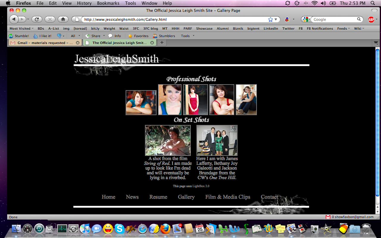
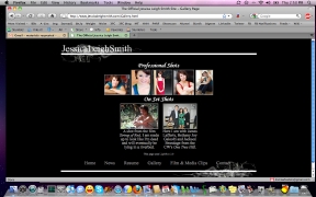
Jessica
has a lovely gallery of headshots and stills on her website. Same with
her clip gallery. Nicely laid out and well-labeled. I like it! |
|
 |
 |
 |
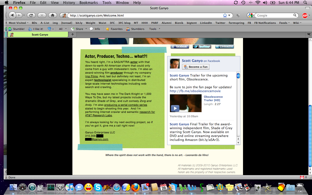
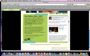
| I like the way Scott
approaches his hyphenate status. There's a tip of the hat to it, sure,
but it's not overpowering and he knows why most people are visiting his
site. Also, I really like the use of the Facebook fan page feed, here.
Nice way to keep the page updated without having to edit and upload it. |
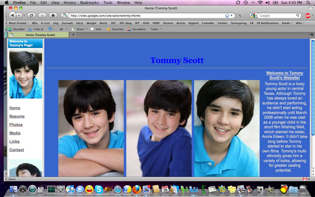
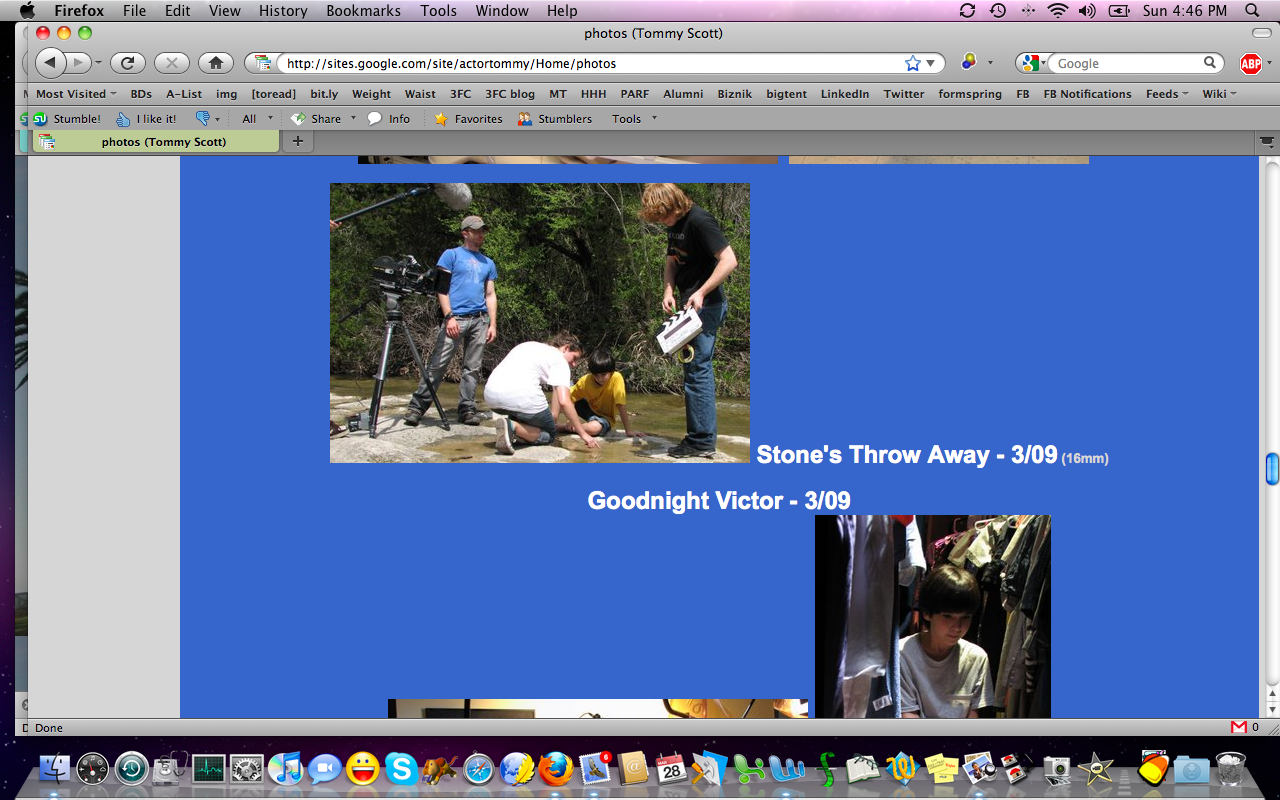
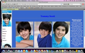
Tommy
is Annie's brother (see Annie's site, up top) and his menu placement is
much better than hers, simply because it's always in the left margin.
That visual anchor lets us know, when we visit other pages, where to
look to navigate, when we're ready to move on. Very important! |
What I'd
recommend, in terms of changes to your site, though, is the use of
consistently-sized thumbnails rather than photos in a variety of sizes
on the "photos" page. Let us enlarge the ones we want to see, rather
than having shapes that don't fit together and loads of scrolling
required to get around that page. |
|
 |
 |
 |
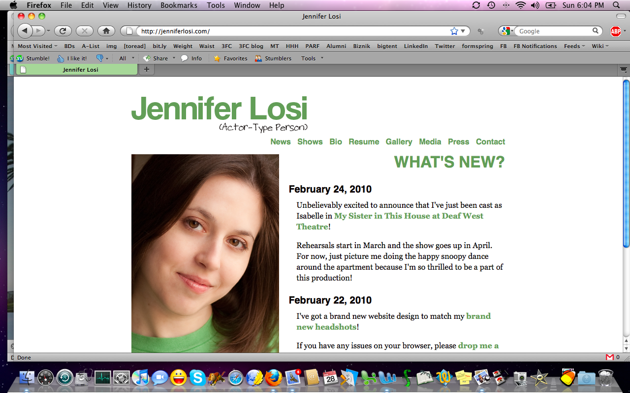
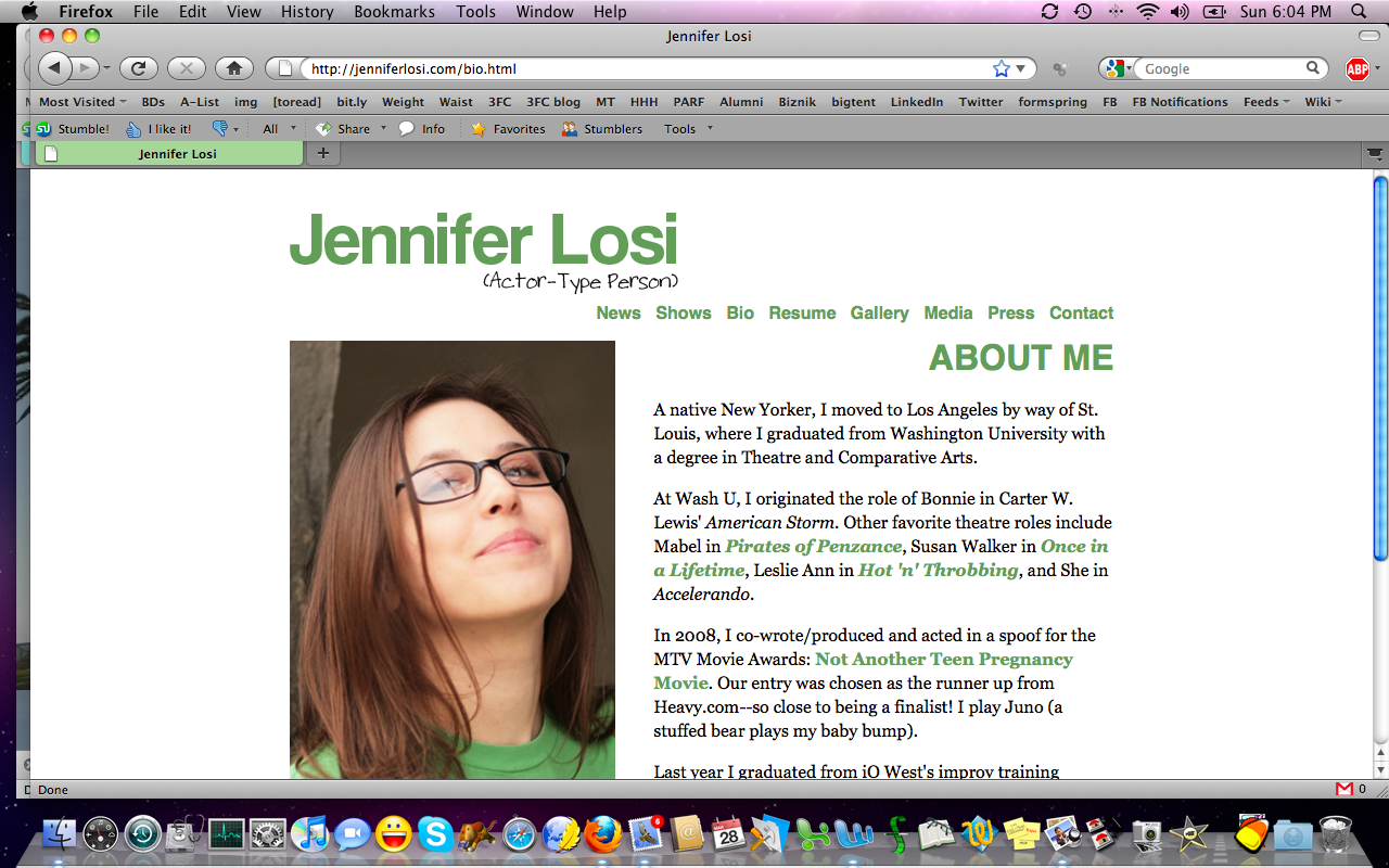
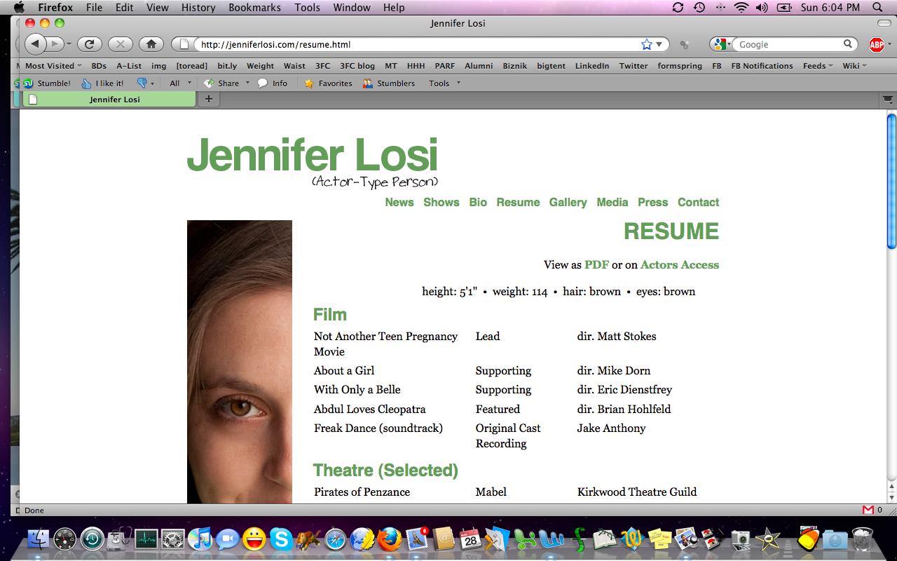
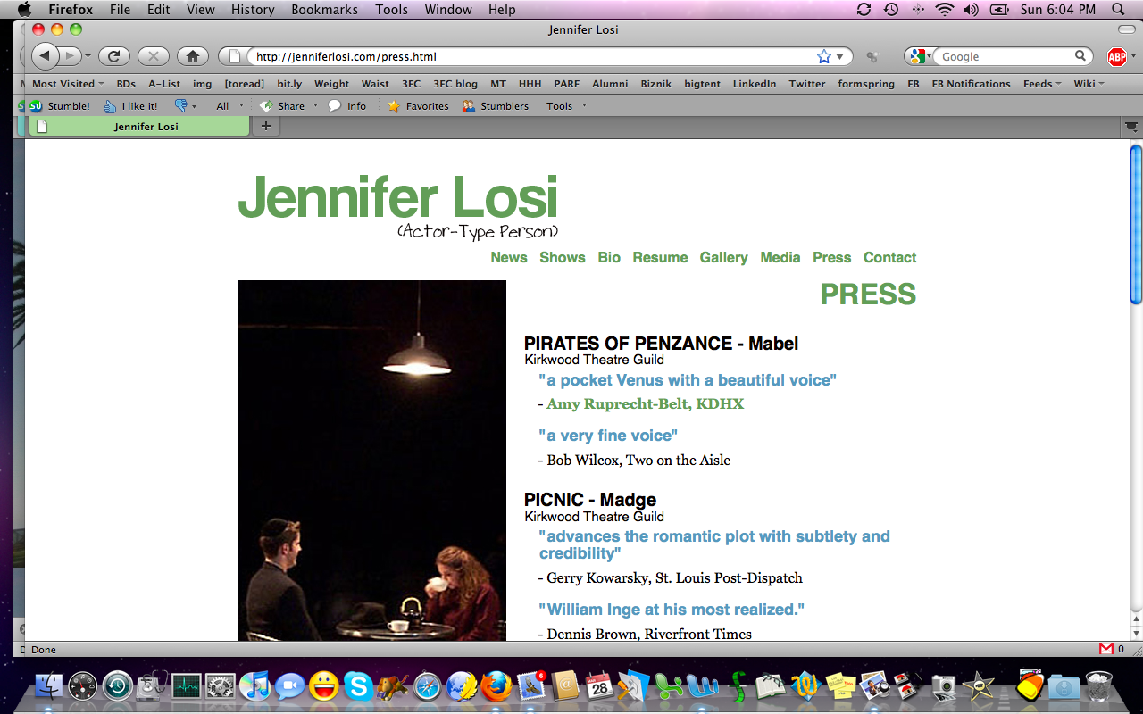
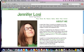
| I threw lots of love Jen's way during the resumé critiques. Gonna do it again now too. |
Love, love, love the colors, the on-brand notes, the use of a different photo on each page in the same place... |
...and how clean the whole site is. So easy to navigate. Not boring. Enough of your youness coming through. |
|
 |
 |
 |
| And great use of wonderful reviews. It's just a really super site. No clutter. No distractions. Well done! |
While I love almost everything about Bryan's site, you've misspelled principal, as in "principal photography" (it's an adjective, so you can remember to use the A spelling). This is a great layout and there's lots of info in not much space! |
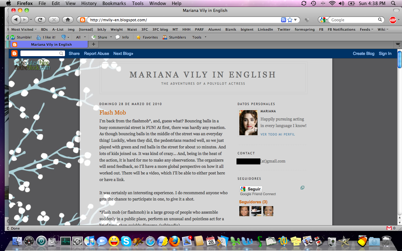
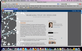
Mariana
is loving her blog. "It has a sense of purpose... some sense of brand,"
she told me. And that's when an actor blog is a good thing. It's
focused and interesting to read, not just a bunch of disjointed
ramblings. Yay! |
|
 |
 |
 |
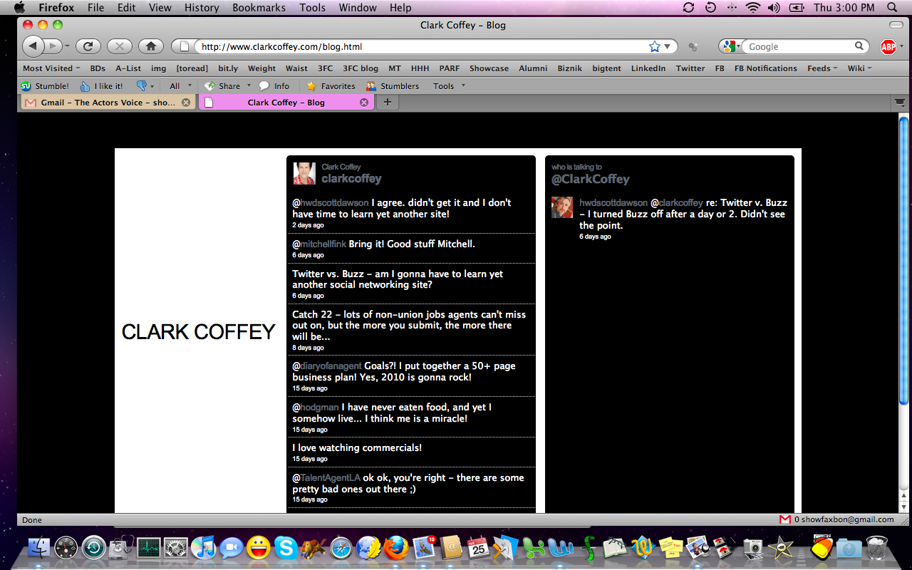
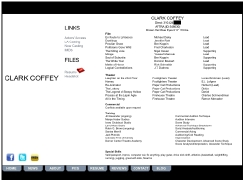
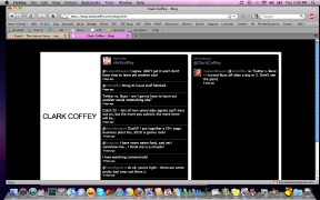
| Clark's
got some good stuff on his site--like, on this page, the IMDb,
Facebook, and Twitter links, plus links to casting profiles. I'd
probably group those together, rather than splitting them across two
spots on the page. Also, the PDF icon is non-standard and didn't
immediately give me the visual I needed to know what it was. Finally,
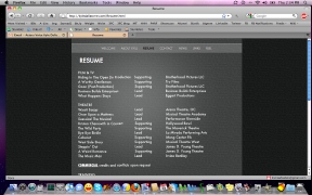
you never need to put your union ID number on your resumé. :) |
This page is called a blog, but it's absolutely not
a blog. It's a Twitter feed. And that's fine! But relabel it so we know
what we're getting, here. A blog would include photos and links and
comments and categories and tags. While Twitter does some of that on a
much smaller scale, it's not what you'd call "blogging" going on, there. |
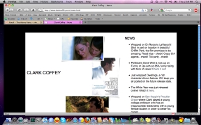
Really like
your use of testimonials and news on your site. Especially the news,
because it includes images, which are nice on a site (breaks up the
monotony of all text). I also like that you've used no dates on any of
this. Some might say that's a bad idea, but I like that it keeps your
career from looking stagnant, if we have no idea when something
happened. Of course, the goal is to always have something happening! |
|
 |
 |
 |
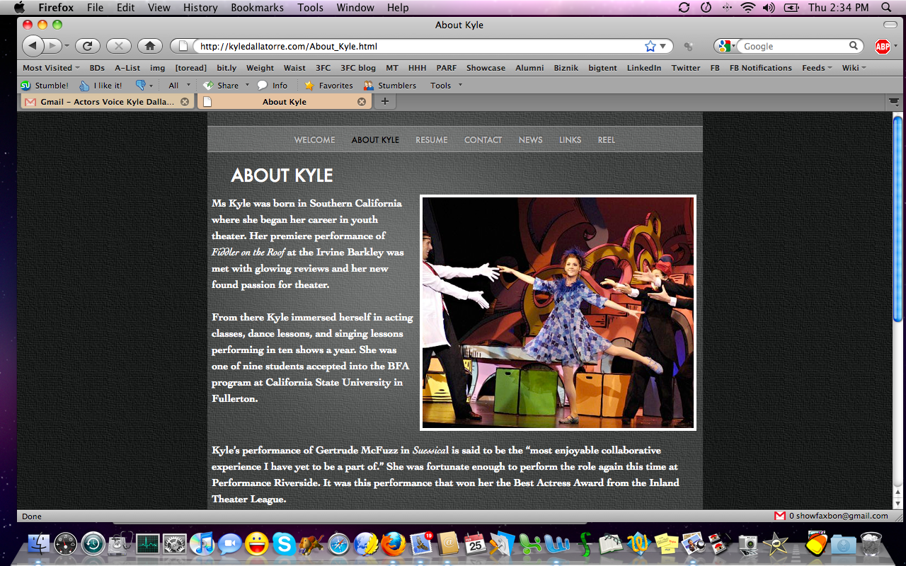
| Kyle's "about me" page is great. Not too
cliché heavy, but it's close. Watch out for phrases like "glowing
reviews" and "passion for theatre." A little bit goes a long way with
those gems. See if you can find phrases that are more you when you edit next time. |
Here's where
we run into a problem on your site, though. You have no printable
version of your resumé. So, when I print this page, I get a "toner dump" experience at
my printer and your name isn't even on the resumé! That PDF option can
make all the difference. |
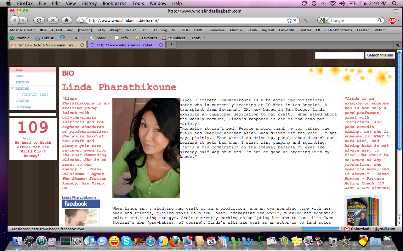
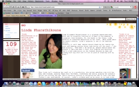
Linda
wants to be sure her site has personality. The wood paneling look of
the background is odd, but I think the peach on white with yellow
flowers is probably you. I
like the testimonials and Facebook widget in the margins, but wonder if
you're also selling DVDs or promoting something that worked for you.
Maybe create a separate "inspiration" page or "sales" page, to be
clear? Also, just not a fan of the "being interviewed" voice of the
bio, nor the cliché Asian driver joke. Give us something more you, here. |
|
 |
 |
 |
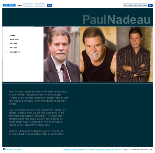
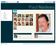
| Paul's site is another that is heavy on the template for my taste. There's very little actor
personality in the site itself, which is the challenge with prefab web
options. The middle photo on the main page, here, seems a little
off-brand. Oh, and why single-quotes for Grace and double-quotes for all other titles? Be consistent. Use double-quotes or italicize titles. |
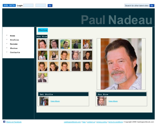
I'd say
there are too many thumbnails to choose from, in your gallery. Get
specific and targeted and your site will be easier to navigate.
Remember the whole issue of talking us out of it, with too many shots that don't serve your brand. Focus like a laser rather than scattershooting like shotgun. |
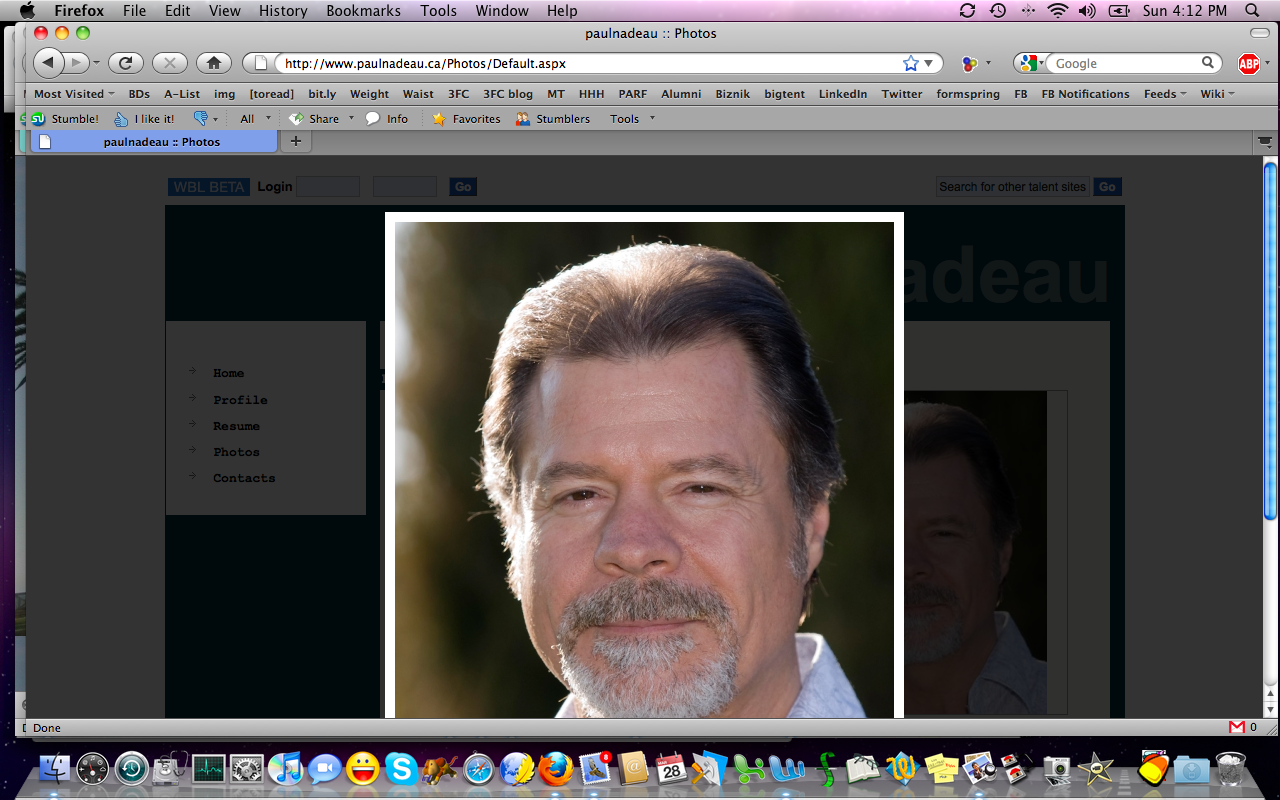
Be certain
your site is smart enough to read visitors' browsers if you include
pop-ups of your headshots. When I selected a shot from your gallery,
the pop-up was far too large for my laptop's monitor. Further, how is
this on an iPhone or BlackBerry? Just some design elements to think
about! |
|
 |
 |
 |
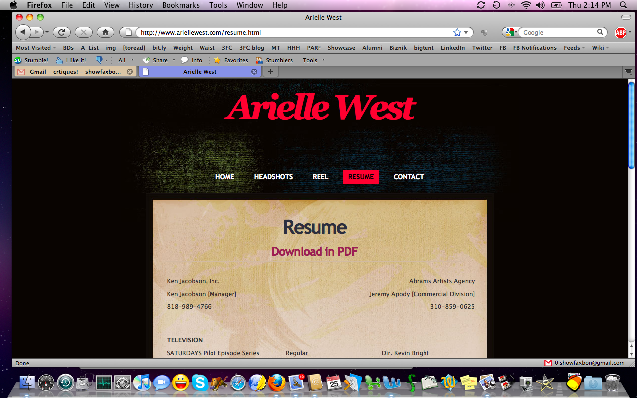
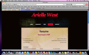
| Arielle's
site is clean and efficient. I'm in love with the fact that your resumé
is offered in a printable PDF but the HTML version is easy to read.
It's awesome. |
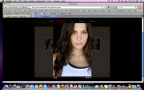
Even more
awesome: You don't offer too many headshot thumbnails (only six. That's
ideal) and when we pop one up, it's not too large for my laptop
monitor. Yay! |
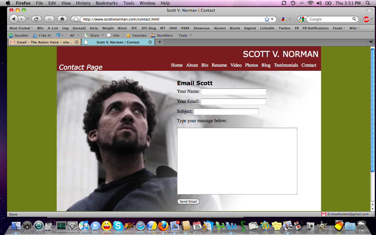
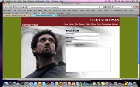
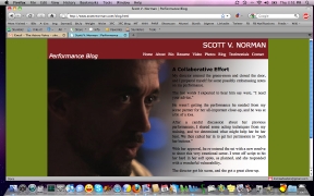
While Scott
has some good things on his site (contact form, testimonials page, bio,
blog), I wonder if these are really "your colors." They don't seem to
compliment one another, nor go with any of your photos. |
|
 |
 |
 |
| I really like
the use of the ghosted photo behind the text, here. The blog pages look
nice. Scott asked me specifically whether "simple" might be overrated.
Nah. Even though people are getting more web-savvy, a good, clean site
is always appreciated! |
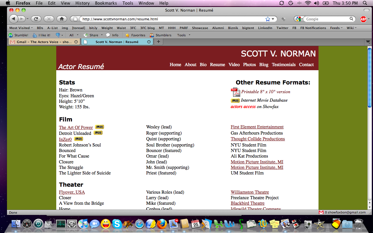
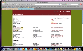
I love that
there are links to your IMDb page, Actors Access profile, and a
printable PDF of your resumé all from your resumé page. Very nice! But
the more I look at these colors together--this olive green and brick
red--the more I'm certain you need a color overhaul. |
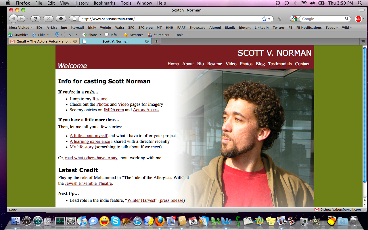
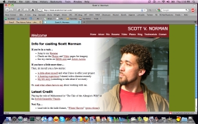
Probably my
favorite part of your site: The jumping off point. You get us
started on your welcome page by letting us know how best to navigate
your site, based on what our needs are and how much time we have to get
to what we need. Very well done! |
|
 |
 |
 |
| I really like the embedded vid, still from the set, and latest news panels on Larry's main page. This is a good, clean, straightforward site. |
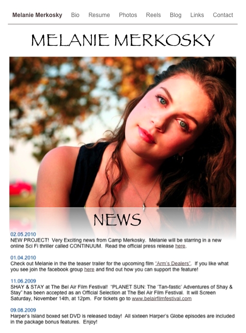
Melanie's tools are all
so great. All of them. You're one of those actors who has absolutely
figured out your brand, your vibe, and how to communicate that
effectively and without clutter. Clean, pretty, simple, with news right
up top on page one of your website. |
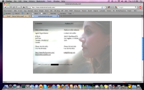
And your
contact info on a page with a ghosted photo that's just lovely. Everyone, poke
around Mel's site. It's really simple and effective, and never
jarringly off-brand. Maybe goal number one in creating a site is
knowing yourself, then how to communicate that becomes clear. |
|
|
| Look at your website like you
look at your home. Its decorations should feel like you. Its vibe
should make us feel "at home" in your space. We should get you by
visiting. Sounds that won't shut off, pop-ups we can't control, and
disjointed or off-brand offerings make us feel uncomfortable visiting
and we won't spend much time getting to know you (or worse, we'll be
sure we get
you, but not the way you intended, perhaps). Simplify. Have fun with it.
Be professional but not so stiff that you forget to show us your
personality. On the flip side, don't have a site so overrun with
personality that we don't get to experience your info which is
a big part of why we visited in the first place. |