| WASTED SPACE | |||
| |
 |
 |
|
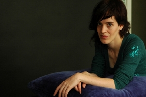
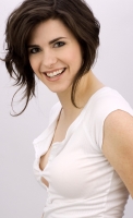
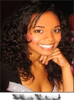
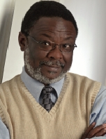
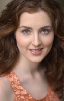
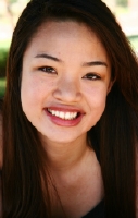
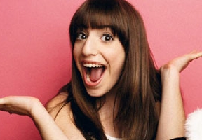
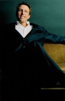
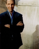
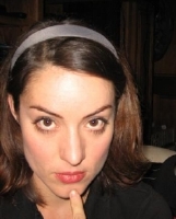
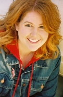
| While "wasted
space"
headshots may look great in hard-copy, they really eat up valuable real estate in your electronic version, where the thumbnail is everything. |
|||
 |
 |
||
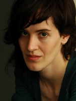
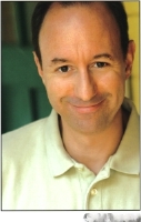
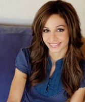
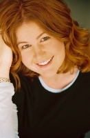
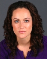
| It's totally
fine to
have a hard-copy that looks different (in terms of cropping) than your
thumbnail did, online. |
|||
 |
 |
||
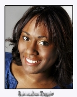
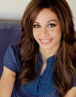
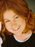
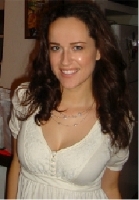
| You can even
keep a
bit of the "off-center" cropping and maintain the mood of the shot, but the closer crop really provides a better thumbnail. |
|||
 |
 |
||
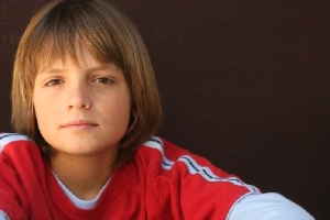
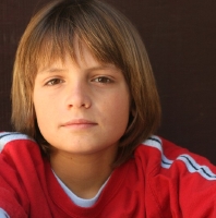
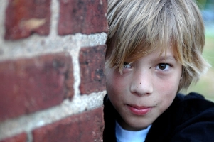
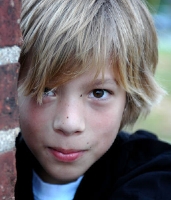
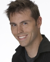
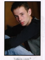
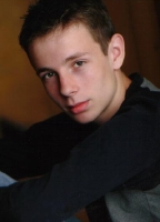
| Just a hint of
the
brick wall is more than enough for us to "get" that this is a playful
boy. Great "type" work, here. And so much stronger (in thumbnail) when cropped tighter. |
|||
 |
 |
||
| The off-center
version of this photo is awesome for postcards. Look at all of that space for scribbling updates or stickering "tune in next week" labels! |
|||
 |
 |
 |
 |
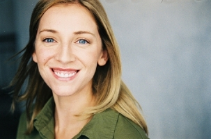
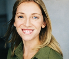
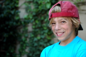
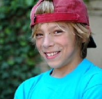
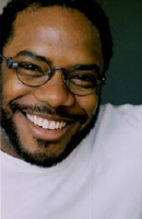
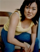
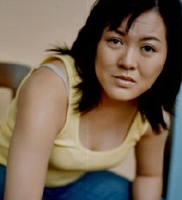
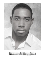
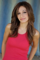
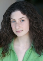
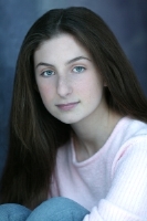
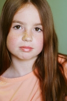
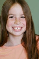
| I seriously
love this
original (2nd) photo, but when you're dealing with the online
services (where
the dimensions are 160x180 pixels), you'll have to choose between a TINY version of the full shot (1st position) or a squished version (4th position) unless you crop it (3rd position). |
|||
|
|
|||
| CLOSER IS
BETTER |
|||
 |
 |
 |
 |
| Now,
don't start thinking that I mean you need to crop in so tightly that
you start losing body parts (you know I've
covered this issue
before--and will do so again, below), but if your primary headshot is a 3/4 shot, definitely crop it so that you have a better thumbnail. Otherwise, your tiny head will be lost! |
|||
 |
 |
 |
 |
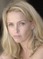
| In
addition to having the "tiny head gets lost" problem, these shots are
also very stark, in terms of their color balance. The white clothes
blow out the actor's face against that dark background. And, in the next set, that dark shirt against the white background "vibrates" a little too much. Cropping helps! |
|||
 |
 |
 |
 |
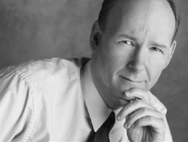
| I actually
like both
of these actors' original headshots, but think cropping helps (at least
at the thumbnail size). You still "get" the vibe from these actors. |
|||
 |
 |
 |
 |
| An excellent
character shot that remains excellent when cropped just a little tighter. It's still off-center, so you don't lose the style either. |
Just a slight
crop is
all that's needed on this shot. The first version is just too "all about the wall" she's leaning on. |
||
 |
 |
 |
 |
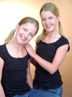
| Young twins
often
have "together headshots" because they are so frequently cast together. I love this shot, but would crop it a bit for online. |
Yeah, I'd like
some
more room by this cute actor's right cheek, but even so, cropping keeps this headshot from being "all about the shirt." |
||
|
|
|||
| WARDROBE
ISSUES |
|||
 |
 |
 |
 |
| Two
lessons on both sets of photos. Cropping helps with the thumbnail-sized
version of the headshot, yes. But there are also little "wardrobe
malfunctions" happening in both shots. A good retoucher can remove a brastrap or fill in a "popping out" button area. Tiny fixes that will keep our focus on the ACTOR. |
|||
|
|
|||
| THE DAMN BORDERS | |||
 |
 |
 |
 |
| Okay, I get
that you
like the "border look" on your hard-copy headshot. Fine! But for the
love of all that is holy, please, please, please never upload your
headshot without cropping out your border. Yeah, I know that means your name goes away, but we KNOW your name, since we're already looking at your online profile! |
|||
 |
 |
 |
 |
| Here, I not only took out the border, but also cropped the photo a bit. You still get the actor's body type and general vibe, and his face gets a lot more space on the screen. | I think an
"inset
photo" is a great way to show
another look (as is printing a "mini me" version of another headshot on your resumé), but I would never recommend using that version of the headshot as your online thumbnail. |
||
 |
 |
 |
 |
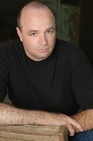
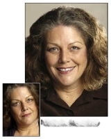
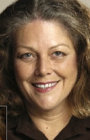
| There are a
few
things wrong with the first set. Border is one, but the bigger issues
are the "way too posed" look of having hand to chin and the fact that
the photo seems to be distorted in proportion. Since I know this actor in person, I can safely say that she is far less "wide" than the first shot has her looking. On the second set, it's a really simple crop (very little change) and, voilà! A much better thumbnail. |
|||
 |
 |
 |
 |
| What I really
like
about the cropping I did here is that you don't lose a thing! You still
totally "get" this actor's primary character type and general vibe. And
we can see those eyes! |
While cropping
helps
this headshot quite a bit, there is still a little bit of a "school picture" feel to it. I think it's the marbled sheet backdrop. |
||
 |
 |
 |
 |
| Cropping helps
this
photo "pop" a lot more--and I believe child actor advocate groups will tell you to avoid photos with bare shoulders (a fetish). |
In addition to
the
border issue, here, we have a "props" issue. You don't need the toolbelt in order to "sell" that you are a blue collar type. |
||
 |
 |
||
| Okay, so this
photo
has three major problems: (1) too much border/white space; (2) a little
bit too much "wasted space" including the actor's leg; and (3) Where the heck is the top of your head?!? |
|||
 |
 |
 |
 |
| Even
a
slight crop helps some headshots. These don't have the "border issue"
as those above, but I found that a tiny bit of cropping made each of them much stronger online thumbnails--without losing any of the actors' personality or style. |
|||
 |
 |
 |
 |
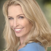
| I
really
like these headshots. It's hard to tell the age of the actor, as she
appears to be 18
TPY (but trying to look 25), but assuming these
headshots do accurately represent the way the actor looks when she walks in the room, a slight crop is all these need--and you still get a sense of her body type and vibe. |
|||
 |
 |
 |
 |
| I am a major
fan
of the big, toothy grin. Especially when the young actor has braces! Sometimes we need kids with braces! Show us what you've got! |
There's a
little bit
of weirdness in this actor's arms. The best way to prevent our eyes from going to anything other than her great smile is to crop! |
||
|
|
|||
| BODY PARTS | |||
 |
 |
 |
 |
| I adore this
headshot. This is a wonderful 18
TPY photo... except for that weird right arm. A tighter crop minimizes the damage. |
I've decided
that
even cropping doesn't save this headshot. It's just odd. The pose is very forced and uncomfortable. Look at the tension in her neck! |
||
 |
 |
 |
 |
| Both sets of
headshots are really great, but reveal more of the actors' bodies than
we need to see. As long as we get a general sense of your build, you're fine. And since thumbnail versions of headshots like these give you only about 10% to 20% "face space," you definitely want to crop! |
|||
 |
 |
||
| Oh, this is
such a
precious headshot... but so ODD. Even with cropping, it's a little
weird, because this lovely little actor looks like an amputee (to channel Janice Dickinson). But the vibe that comes from this photo is amazing. I'd use a shot like this in postcards, rather than as a primary headshot. |
|||
 |
 |
||
| Another
absolutely
wonderful headshot, filled with so much information about the actor's
primary type and general vibe. The problem with the uncropped version is that it looks like an ad... and if you're submitting your headshot commercially, why would you want anyone to think about any other product? Cropping maintains the energy without screaming "conflict"! |
|||
|
|
|||
| RULE BREAKERS | |||
 |
 |
 |
 |
| Some
rule-breakers work. Others don't. The first shot needs a little
cropping (to minimize that upper arm bleeding off to infinity and
beyond), but is very "indie film." The second seems very natural, and could happen to lead to hand modeling gigs! While I like the third shot (as a photograph), I think it's a bad headshot... unless I already know the actor and his work. It sells a great type and vibe, but I'm so very distracted by the photos on the wall and the shoe in the foreground otherwise. The fourth shot looks like it was ripped from a magazine. And that's not gonna help you get into an office you've never been in before. Another great "placeholder" headshot, but not a great first impression. |
|||
|
|
|||
| SOMETHING IS
MISSING |
|||
 |
 |
 |
 |
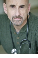
| I
know I
covered
this issue a lot in the previous
series on headshots, but it's
still happening. Entire chunks of actors are being left out (and I really don't think this is the correct interpretation of the "leave 'em wanting more" maxim. *sigh* Oh, and no one needs a headshot with a stethoscope (in a sweater??) nor does anyone need to appear as though he's trying to "leave" the frame. |
|||
|
|
|||
| CAPTURING YOUR ESSENCE |
|||
 |
 |
 |
 |
| This first
shot is,
face it, a mug shot. I don't care what you're going for, stylistically.
That photo was taken by a man in uniform. I love, love, LOVE the second shot... which is obviously a candid. But it captures the actor's spirit in a way that the others do not. If you're not comfortable with your headshot photographer, CANCEL THE SHOOT! You should connect with that camera as if your best friend were behind it. The third shot here is a good commercial shot, though I'm not a fan of the backdrop. The shot comes close to being good. The fourth shot is a much better theatrical shot than the first one, but still feels a little disconnected (especially when compared to the wonderful second shot). |
|||
|
|
|||
| SHOTS NOT TO USE |
|||
 |
 |
 |
 |
| If
this shot
were taken in front of a different backdrop (and without the red
border), it would be much better. |
The
über-green screen backdrop is way too intense. This headshot looks
to be part passport photo, part special effects movie still. |
Love
it for
MySpace. Leave
it there. |
I
actually
don't mind an actor taking a photo of "my current facial hair" and
including it with a submission. But get dressed before going on camera. |
 |
 |
 |
 |
| These shots
aren't
actually "shots not to use," but I didn't know where to put them,
otherwise. The first is way too "school photo" in feel. Perhaps going
B&W with it would help mute the background. I like the second one, but want to feel more connected to the actor somehow. And the final two are great to show a "curly hair/straight hair" set of options. Problem is, unless you know which headshot got you called in, you may show up not quite right for what they're expecting. Also, I'd love to see a little open-mouth smile action from all of these actors. |
|||
|
|
|||
| EXCELLENT
SHOTS |
|||
 |
 |
 |
 |
| And
we end this week with some of my favorite headshots! Here we have a
great indie film/woman in trouble shot; a lovely, thoughtful, classic shot; and two really fantastic kid actor shots. Awesome composition and cropping. I love 'em all! |
|||
 |
 |
 |
 |
| Even though
the first
shot is against a backdrop I'd usually dislike, it works somehow. The
second shot is one of my all-time favorites. Love it, love it, love it.
The third is nice and simple. Very clean and straightforward. And the fourth shot is so fun! I'd crop it maybe a few inches at the bottom, but that's just me being super nit-picky. |
|||
 |
 |
 |
 |
| Four more
great
shots. I seriously want to cast all of these actors. These photos make
me smile in their simple, straightforward, "actors not trying to be anything other than who they are in real life" kind of feel. Awesome! |
|||
 |
 |
 |
 |
| I just love
these
headshots! I don't know why. Maybe it's like watching Simon on American Idol and wondering what he
means by "The IT Factor." I just really love these photos and have a positive association with these actors because I totally believe that they ARE these people. |
|||
 |
 |
 |
 |
| Another great
set of
shots. I love the "fringe" border on the first. I'd probably like a
little more straight-face-on look in the second one. I'd crop the third
just a bit to get "more face" in the thumbnail. And that last photo is a great character shot. Absolutely, this is an actor who knows how he gets cast! |
|||